FINDING THE RIGHT WIPER BLADE,
IS A CLEARER EXPERIENCE THAN EVER
You need the right wiper blades, right when you need them most. The last thing you need is a stressful interactive experience in finding the right size and connector for your vehicle.
I was the design lead for the global rebrand of the TRICO Wipers web and mobile site with our goal of helping drivers find the right wiper blade.
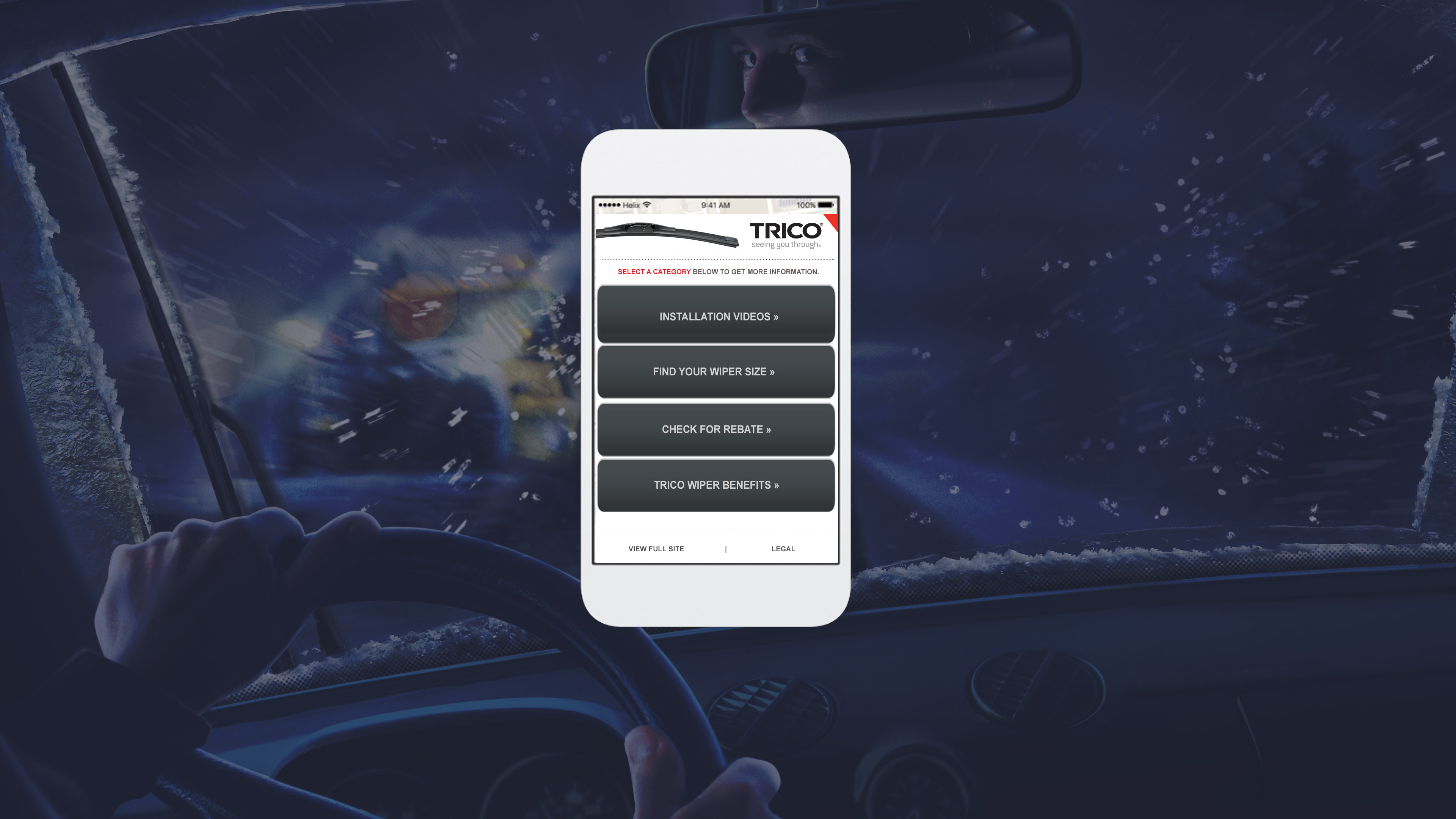
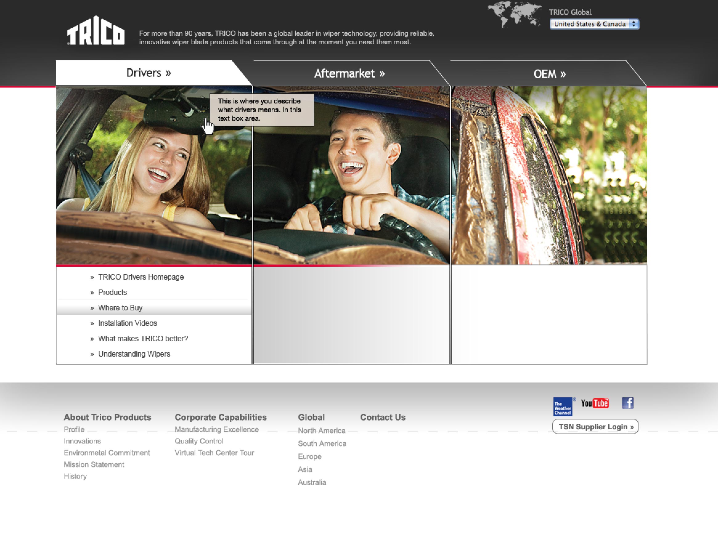
The scope of the project was assessing the needs of multiple audiences, designing wireframes, testing the experience and designing the assets for the site. My role was to work with UX researchers to confirm the needs of users and ease of accessibility through design. Visual design and art direction of the campaign assets for art delivery were the concluding steps for the project. After the website was complete I served as design lead on the rich media advertising and animation to help propel brand and product awareness.
DESIGN FOR THREE DIFFERENT USER TYPES
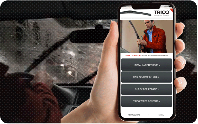
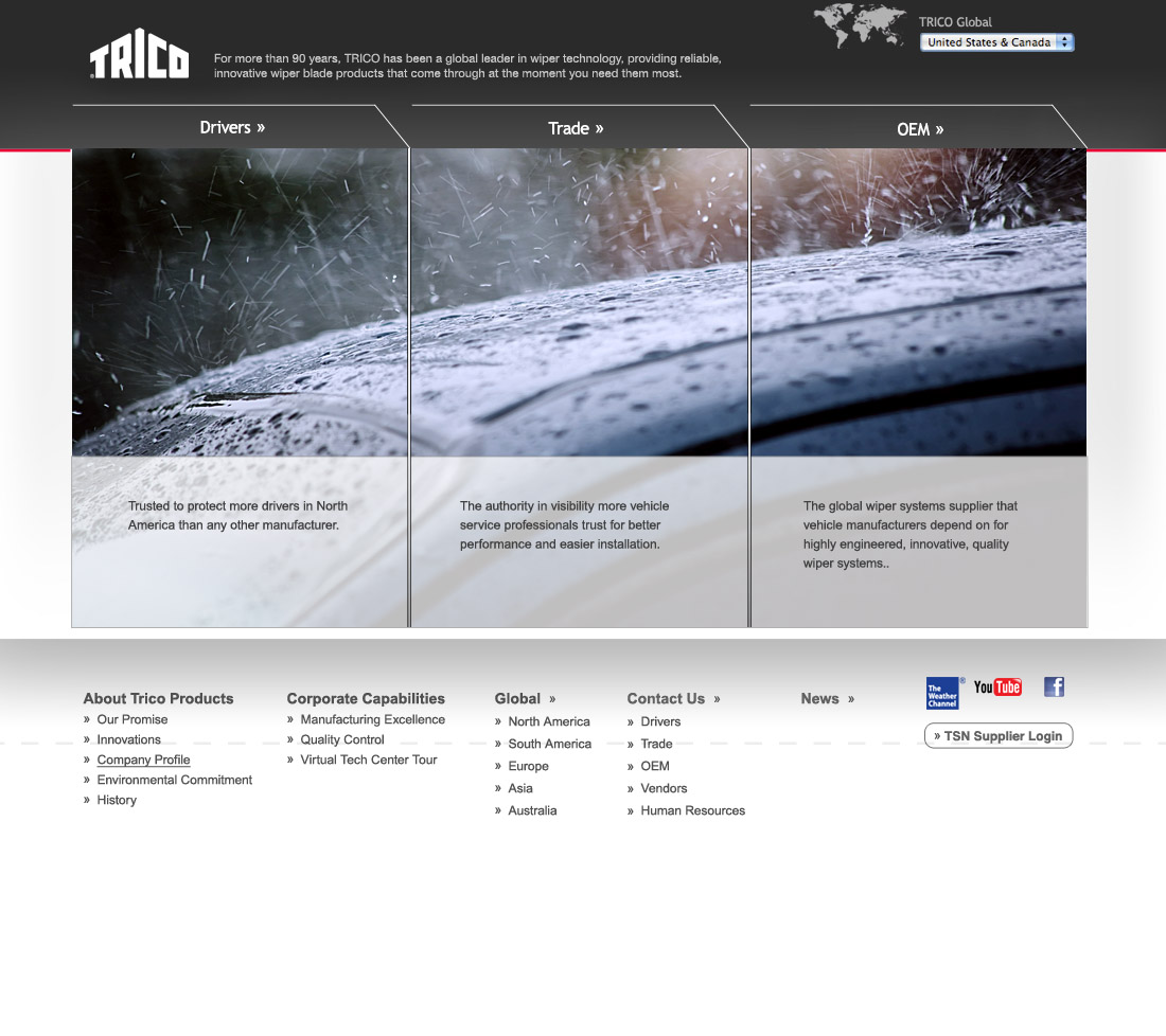
Early on through user studies, we determined the website needed distinct portals to serve the needs of the different audience types.
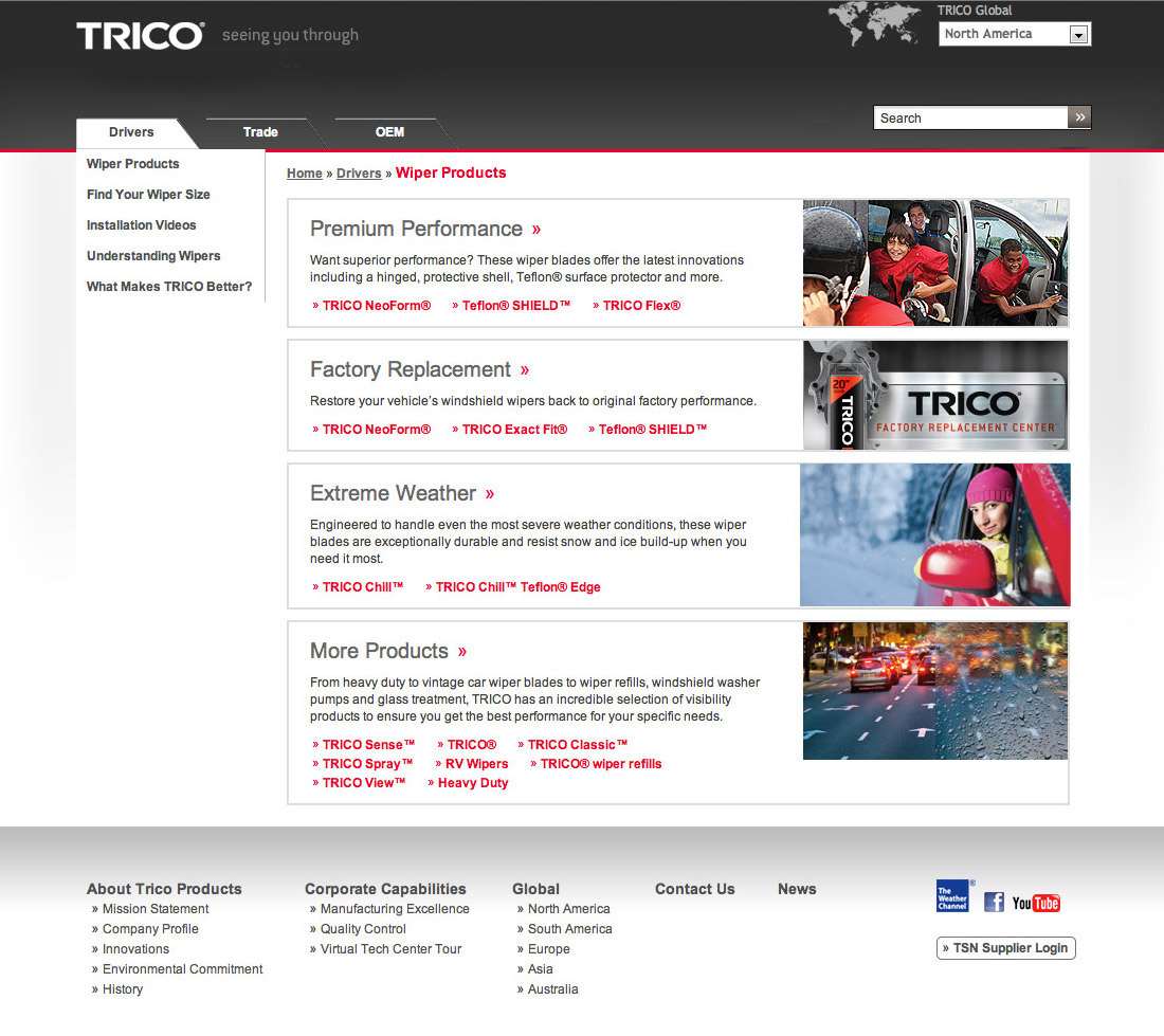
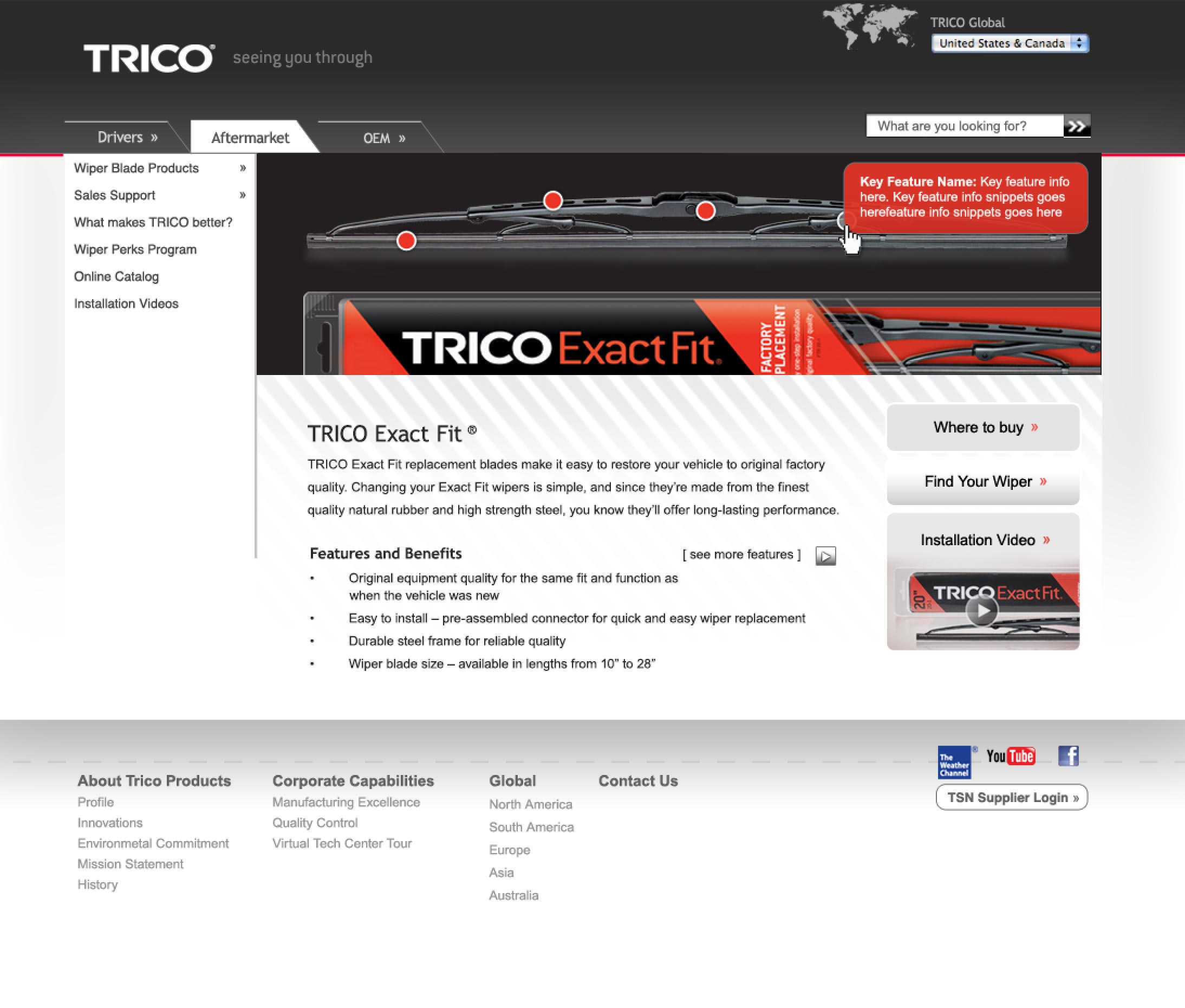
Drivers were in most need of finding wipers to match their vehicle paired with installation videos to help them remove the old wipers and install the new set. Getting drivers from point A to point B was vastly different than Tradepersons and the OEM/Industrial audience looking for marketing materials and technical specifications. Our research led us to create three entrances to the site.
THE CHALLENGE
GAIN INSIGHTS WHILE MANAGING PRESSURE OF A NEW PRODUCT LAUNCH DATE
The website project ran parallel to a broader brand relaunch which I was part of the design team as well.
The main 500-foot goals were:
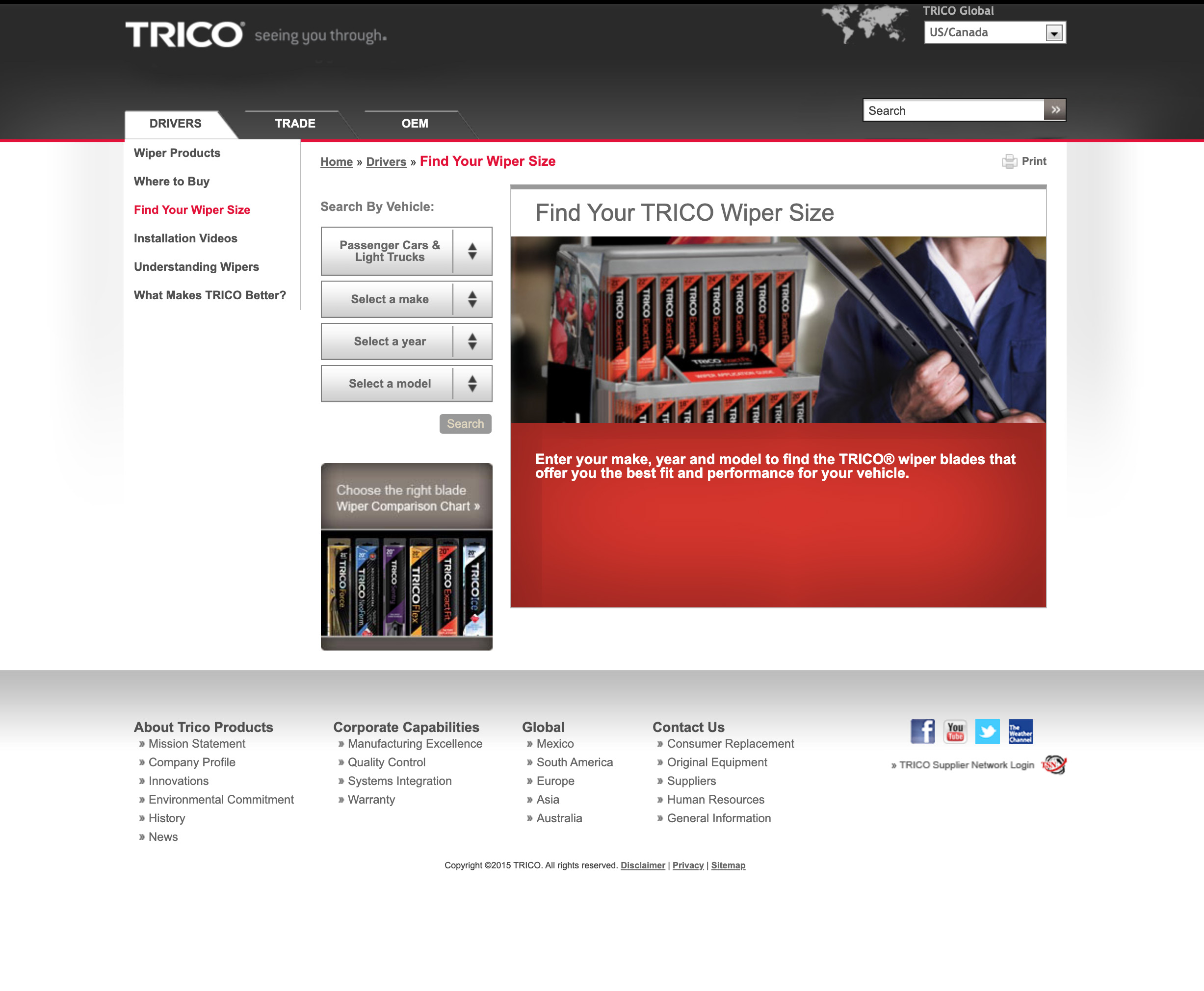
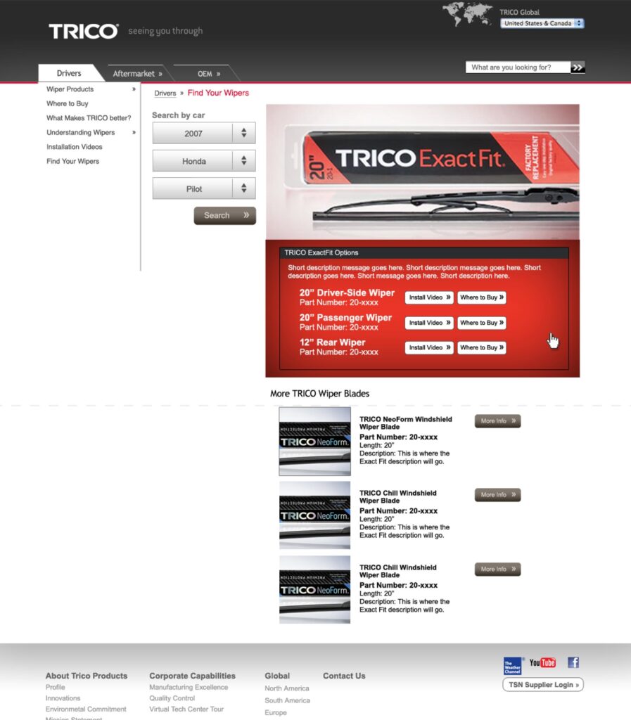
- Make accessing the proper match wiper blade as easy as possible
- Build a knowledgebase to reinforce TRICO as the leader and innovator in the wiper blade marketplace
- Make a seemless process from QR tags on packaging to mobile website

MY ROLE
I led the design of the global website rebrand, taking insights learned about the audience from the researchers and tested from a 20-year client relationship on product marketing and convert those learningd into actionable wireframes, prototypes, and visual design.
I worked alongside the Account Team, Researcher and Product managers, and engineers to test usability of the experience.
Once we completed usability testing, design adjustments were made to the wireframes and information architecture. I worked with preparing visual design assets, art direction of photography to developers, and engineers to ensure the design vision and continuity from prototypes was met.
THE DISCOVERIES
USABILITY STUDIES REVEALED INSIGHTS
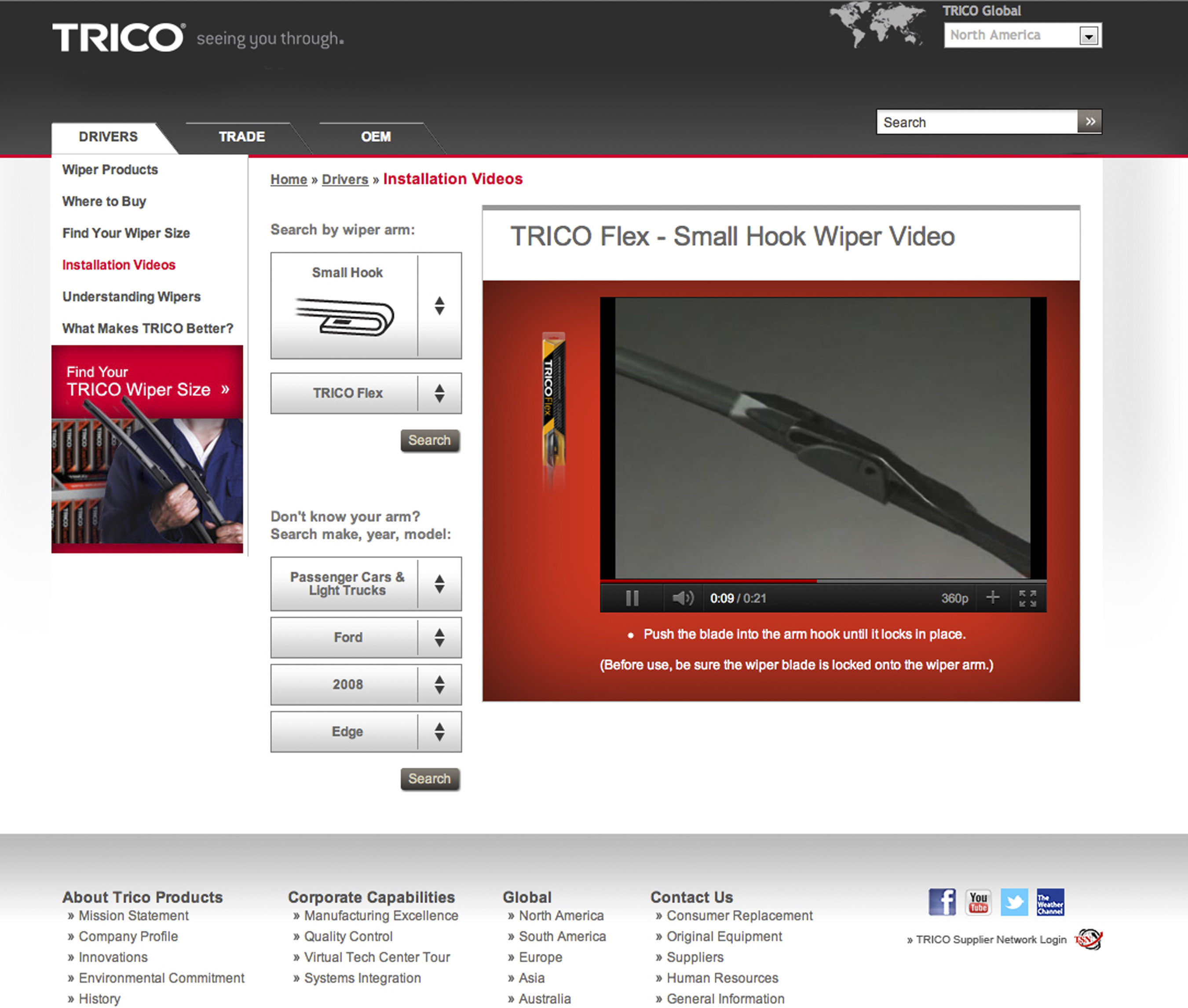
Mechanics and drivers in focus groups revealed to our team that they needed visual aids for the wiper arm connection type. Names alone did not suffice. After prototype launch, we conducted click tracking tests in our on-site research facility, revealing that people infrequently used search-by-vehicle function for installation video searches. This informed us in design to switch the priority to search by wiper arm and wiper brand features.
CAMPAIGN INTEGRATION
CARD SORTING STUDIES REVEALED LANDING PAGE INSIGHTS
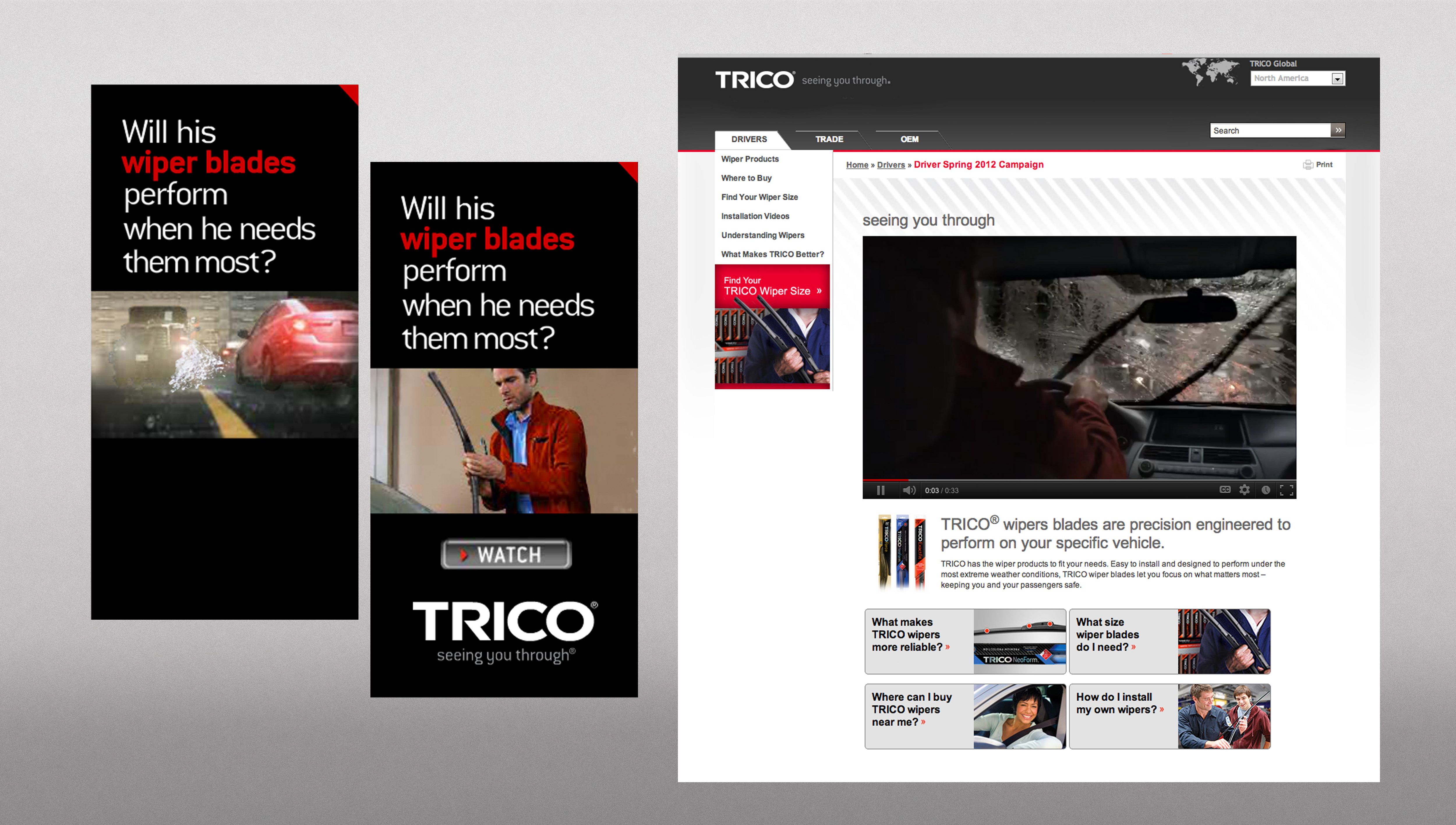
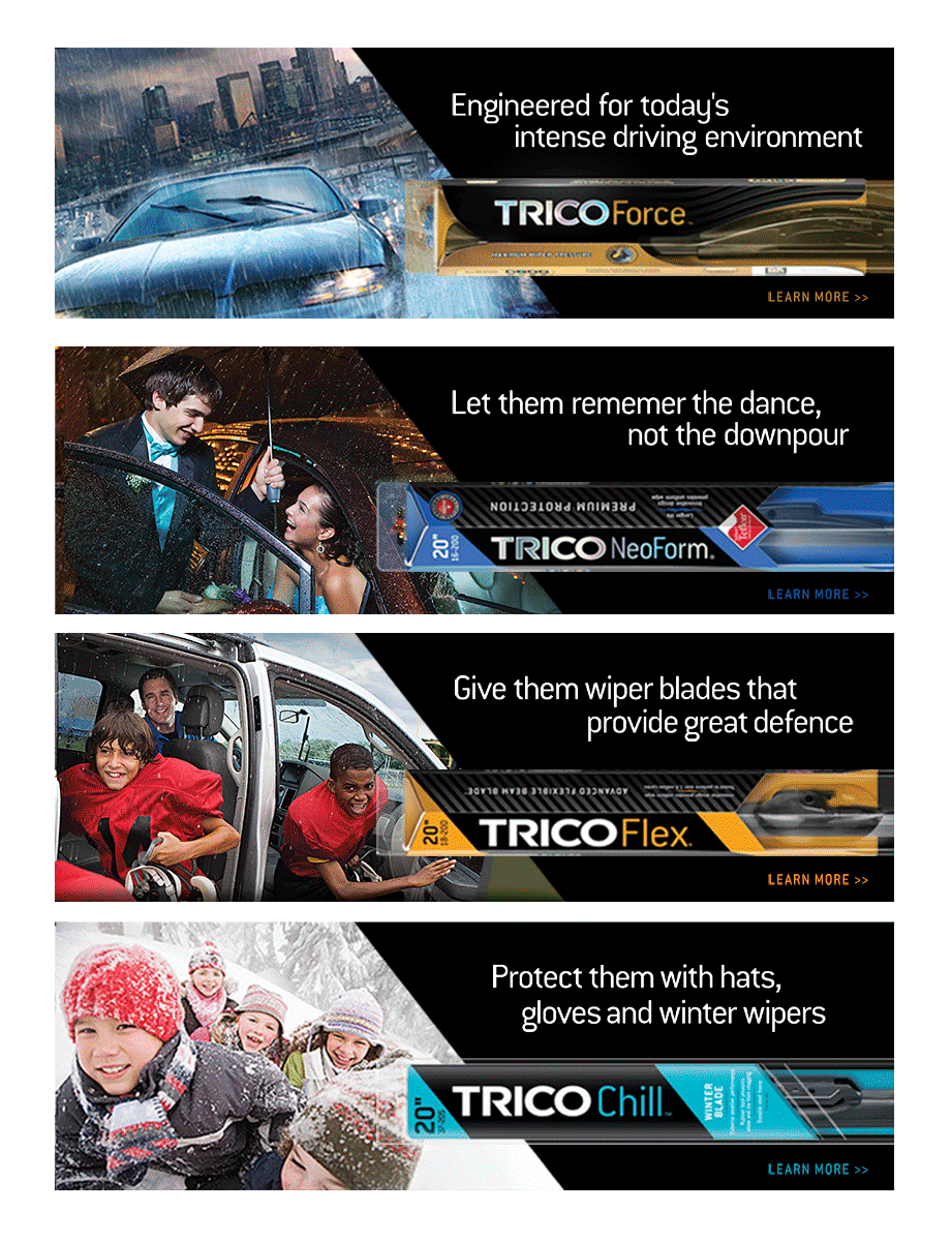
I created the storyboards for a TV spot that was featured in a rich media advertising campaign designed to drive traffic to a landing page, introducing consumers to the brand.
The landing page directly helped answer the key consumer questions identified in our card sorting research to help us accomplish user needs and business objectives:
- What makes TRICO Wipers more reliable?
- What size wiper blades do I need?
- Where can I buy TRICO wipers near me?
- How do I install my wipers?
CAMPAIGN INTEGRATION
Our design team created the storyboards for a TV spot that was featured in a Rich Media Advertising Campaign we designed to drive traffic to a landing page to introduce consumers to the brand.
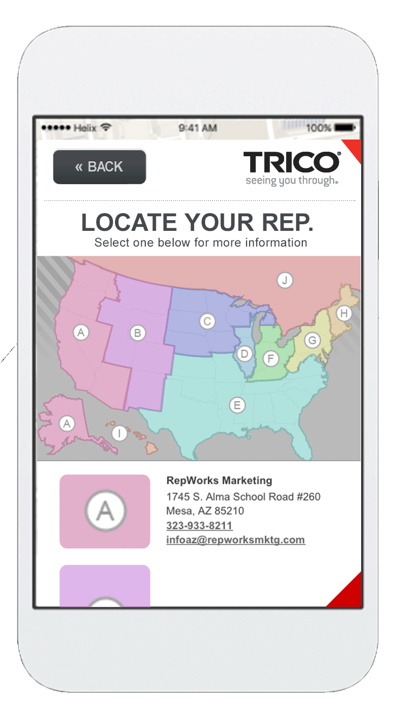
The landing page directly helped answer the key consumer questions identified in our research and accomplish our business objectives:
1) What makes TRICO Wipers more reliable?
2) What size wiper blades do I need?
3) Where can I buy TRICO wipers near me?
4) How do I install my wipers?
THE RESULTS
The new website and campaign helped increase brand recognition, and sales relative to most competitors. The website and knowledge base also helped affirm OEM and trade audience relationships.
“The newly launched TRICO Products’ trade website has hosted an average of 4,000 unique visitors per month with an average of 30,000 total visits per month specifically for the “online catalog.” The online catalog allows Aftermarket visitors to search for the right wiper blades by selecting vehicle type, year, make and model. This designated portion of the site also provides trade professionals and technicians with comprehensive product descriptions, full installation videos, sales support and product ordering information.”
From shipping software to crafting experiences, I've been around the block
Here are some stories and case studies from my design experience:
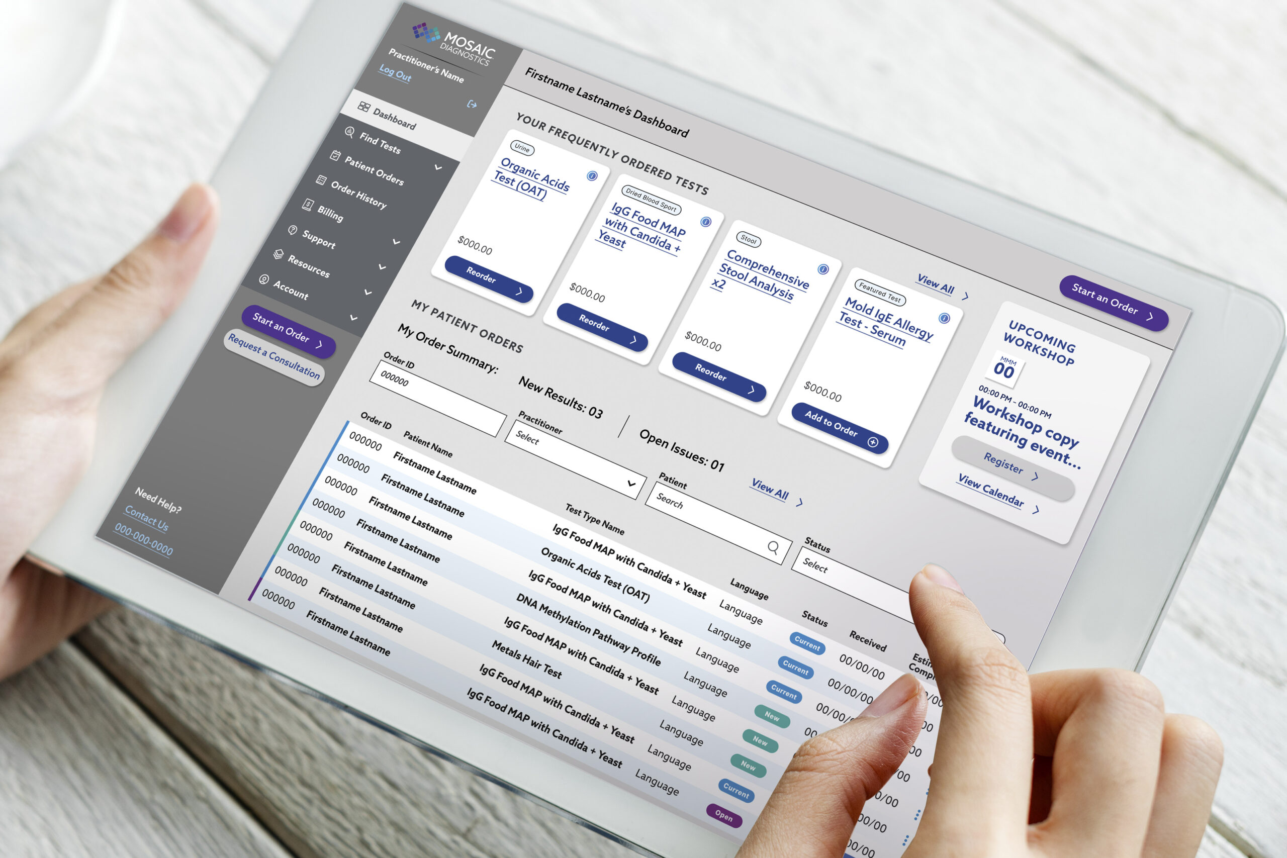
A health tech platform that optimizes test kit delivery
My product design journey improving the the portal experience for patients and practitioners—driving results for end users.
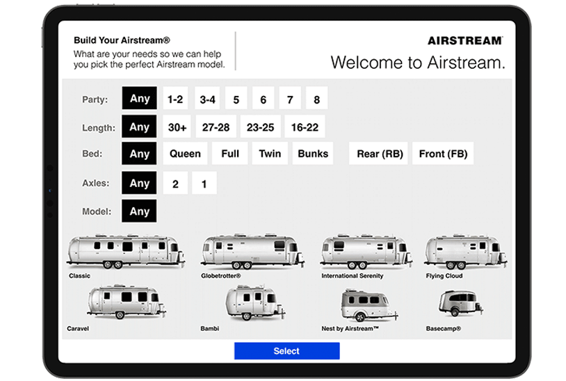
A tool to help customers select an Airstream model to fit their camp style
My journey through camper research, customer interviews, and leading the product design for a tool designed to increase consumer confidence.
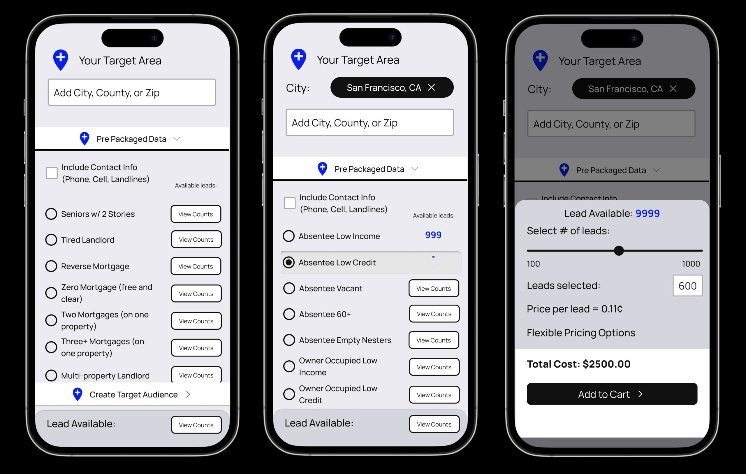
Auditing a real estate data Saas product to improve ecommerce
Improving an ecommerce user experience for a real estate data provider.
Mobile app and experience projects
A review of screen captures for a few mobile interaction design products that lead into comprehensive product design case studies.
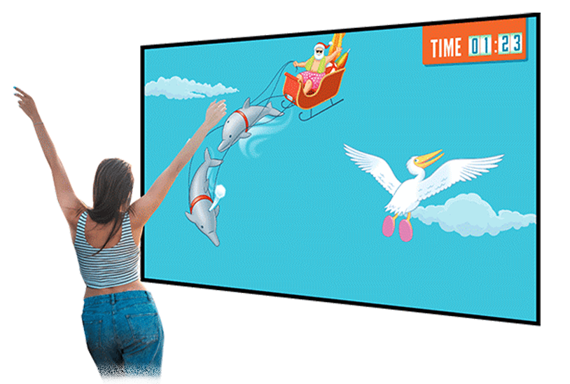
Changing the way a global hospitality company creates interactive proposals
I brought to life a business pitch and proposal with interactive elements, sounds, videos and immersive experience that helped my client tell their story in a memorable way.
A pop up home experience that brings energy saving products to life
A case study that walks through the planning, design and execution for the traveling mobile exhibit that packs in four rooms of a household into a carefully designed, 5x5 foot space.
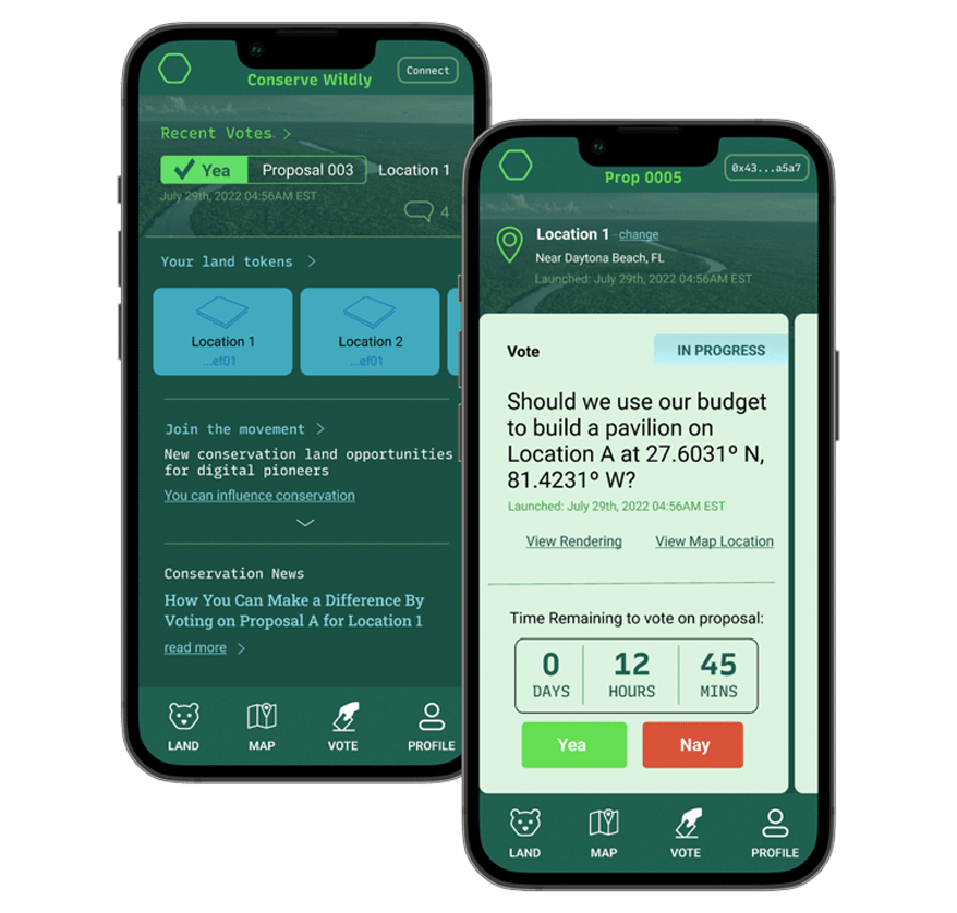
Designing a web3 platform to enable user access environmental conservation initiatives
Conserve Wildly is a mobile app platform designed to make it easy for allow citizens to vote on local conservation protection measures and proposals.
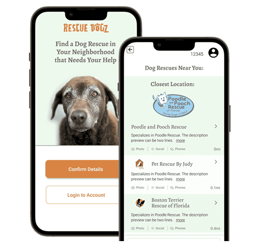
Matching volunteer's talents with dog rescues that need their help
The Rescue Dogz app is a platform connecting skilled volunteers with nearby dog rescues that need their help.
Want to learn more about me?
Feel free to reach out.


