Designing a tool to help Airstream customers choose the right model camper.
In 2020, I noticed there were many Airstreams for sale on the secondary market while new sales were at an all time record high. I suspected customers were not happy with their camper and wanted to learn more about the problem to see if there was an issue that user experience design could help solve.
My role: Independent Product Designer
Skills leveraged: Research, Product Design, Project Lead
Deliverables: Research, Pitch Presentation
I drafted a number of versions of each screen and feature addressing do they solve the user pain points.
Time for research
I conducted secondary research to try to find some insights into the issue of newer Airstreams flooding the secondary market.
In 2020 I learned:
- 387 airstream for sale on RV Trader in the USA were less than 3 years old
- On RV rental websites, newer Airstream accounted for less than 0.03% of available inventory
- Airstream’s parent company Thor had an all time high sales year of $8 billion USD.
Let’s find out from how current Airstream customers felt.
Research: I interviewed over a dozen Airstream owners to learn customers prioritized aesthetics and lifespan longevity over livability and functionality.
Pain Points: First time camper buyers frequently purchased the wrong Airstream for their needs. There are over 60 models and size options to choose from and often model options are not available for viewing at dealerships.
How can we use design to improve the customer experience for Airstream?
THE PROCESS
Target user personas and their needs
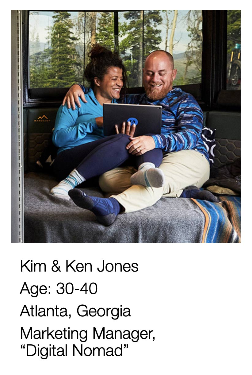
1) Kim, Ken and their 2 kids under 10
Problem: They want two twins and a bunk combination that sleeps at least five.
Meeting Needs: Design an app that allow them to quickly see all models that sleeps five and have a bunk configuration.
2) Retired Bill and Martha
Problem: They want a camper to travel full-time in and don’t really have a sense of what the differences are between the 25ft models across different lines.
Meeting Needs: Design an app allows them to compare up to three models after narrowing down the length specifications.
3) Millennial Mindy and Mike
Problem: They want an Airstream to sleep six so they invite their friends to their campsite for parties.
Meeting Needs: Design an app can lets them browse all the models that sleep 6 and show them a variety of sleeping accommodations.
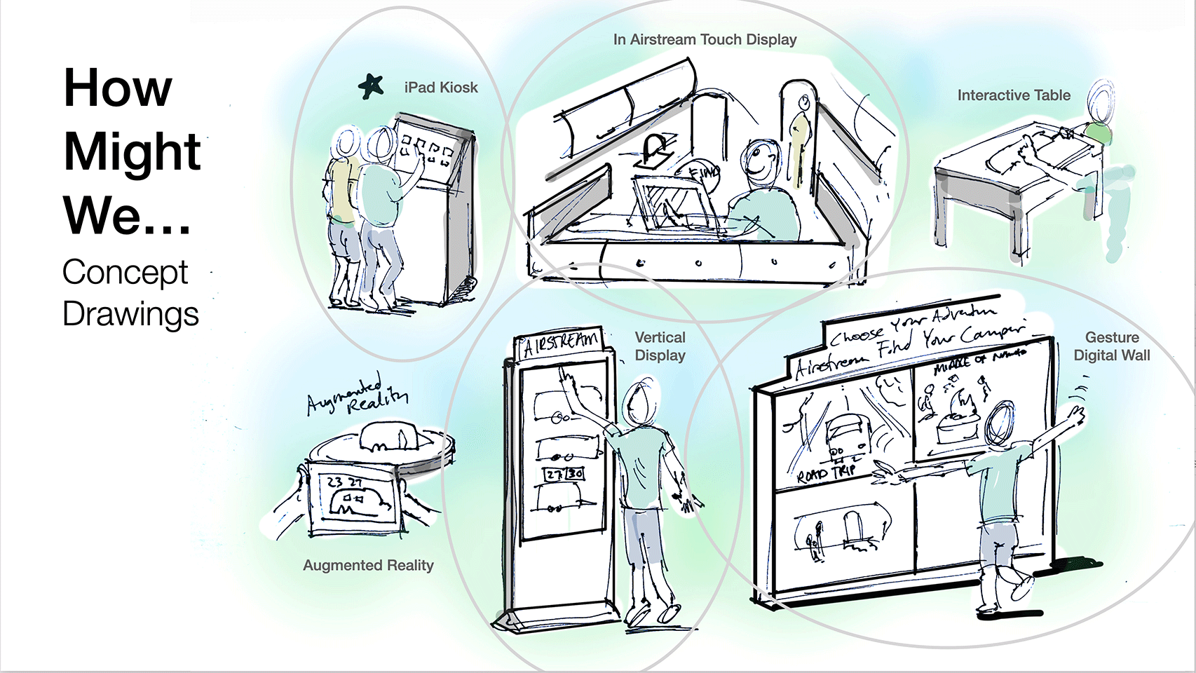
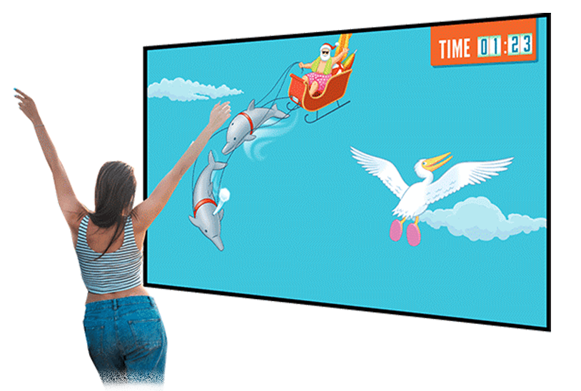
I considered a few approaches, gesture based digital wall where you can simulate camping activities, campfires, vertical display where you can view all the models in a very large form factor.
Since the highest level of stress for buyers was at the dealership, I would attempt to design a solution that was easy to live within various areas of the dealership
My Role
I led the project as a solo owner, researcher, designer, building a case to present to the client.
A pathway to a soultion
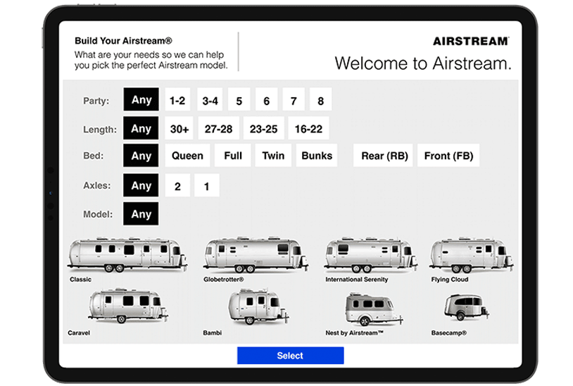
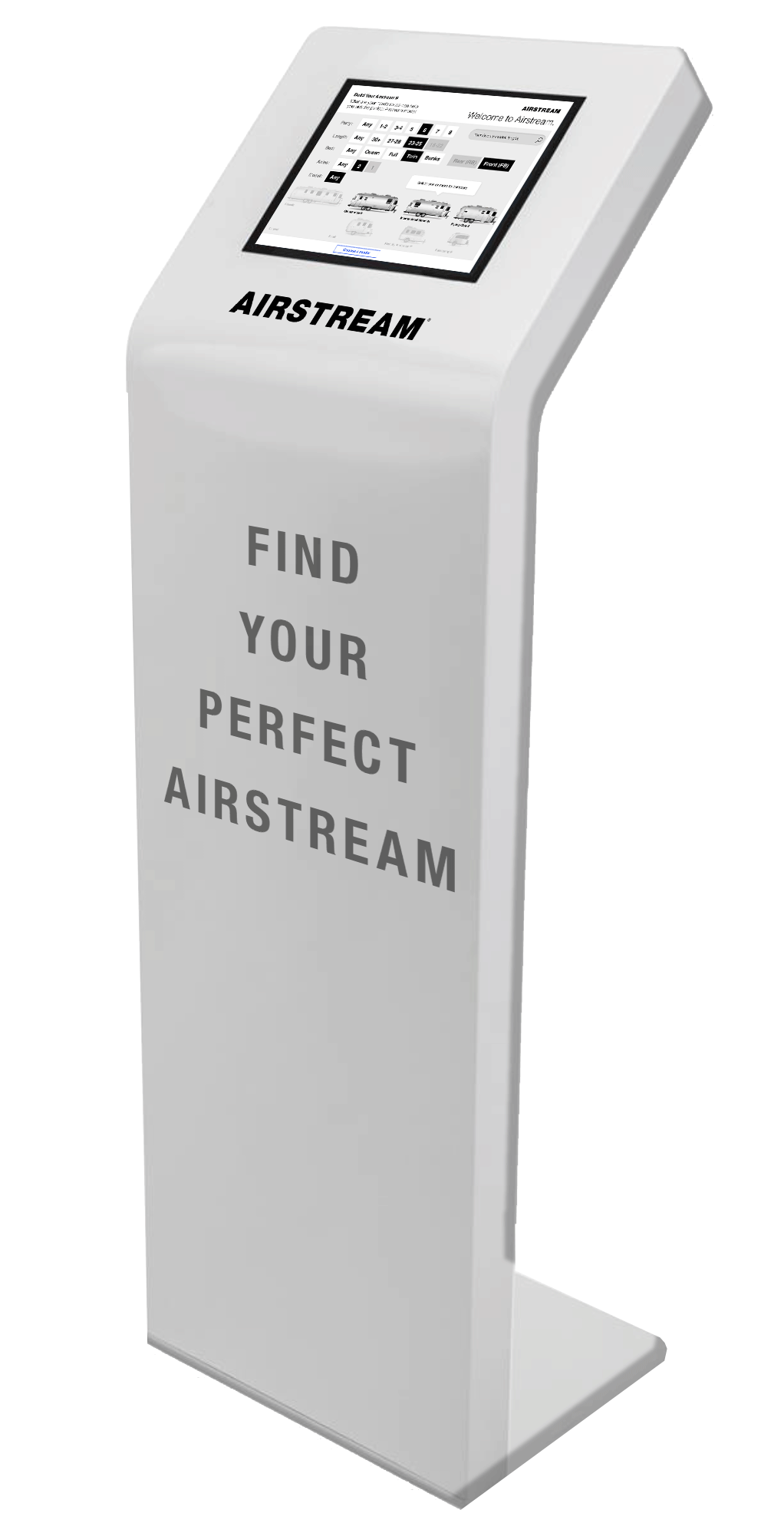
I identified the primary application for the web app to be in Airstream dealership lobby locations. An iPad Pro built into a kiosk at dealerships so users can explore, customize and personalize their own trailer while being surrounded by a few of the options in person.
The primary design feature
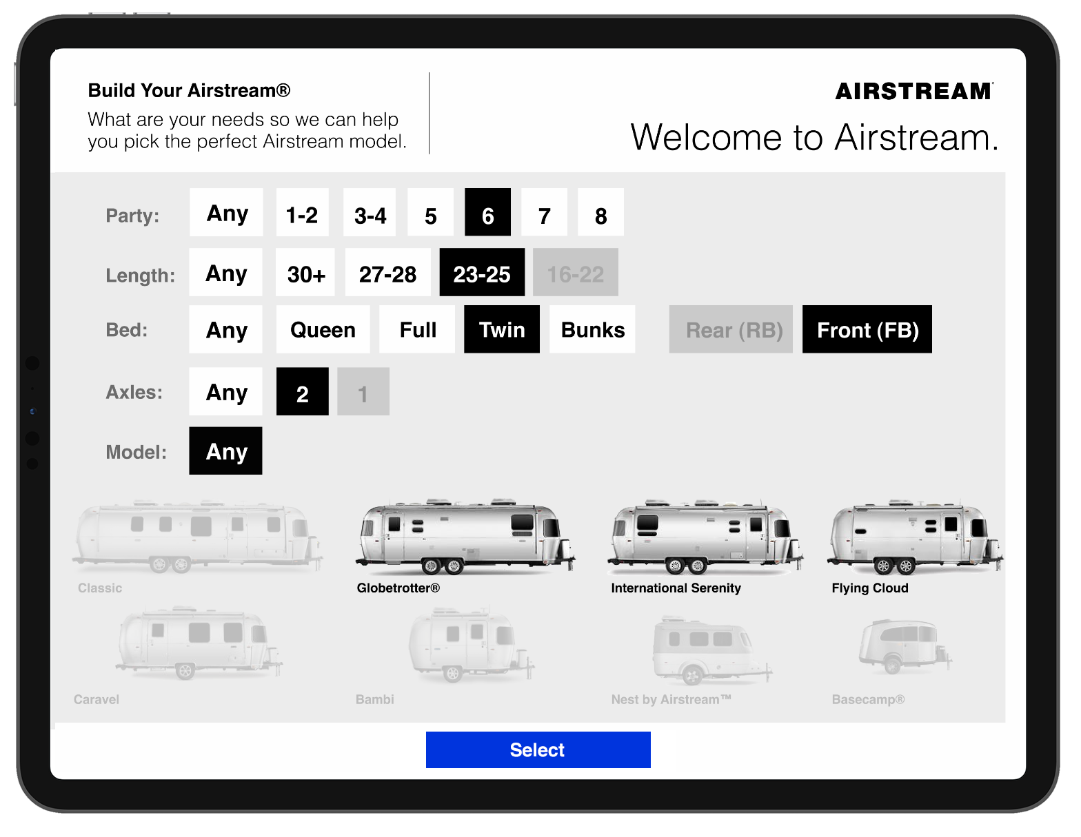
Our personas needed a way to simplfy their choices. I designed the interface to be based on a powerful subtractive filter.
Airstream trims, colors and design treatments that make the configuration possibilities in the thousands. Customers want to make sure they are selecting the right options and package. They can easily get overwhelmed. This tool is designed to reduce selection fatigue.
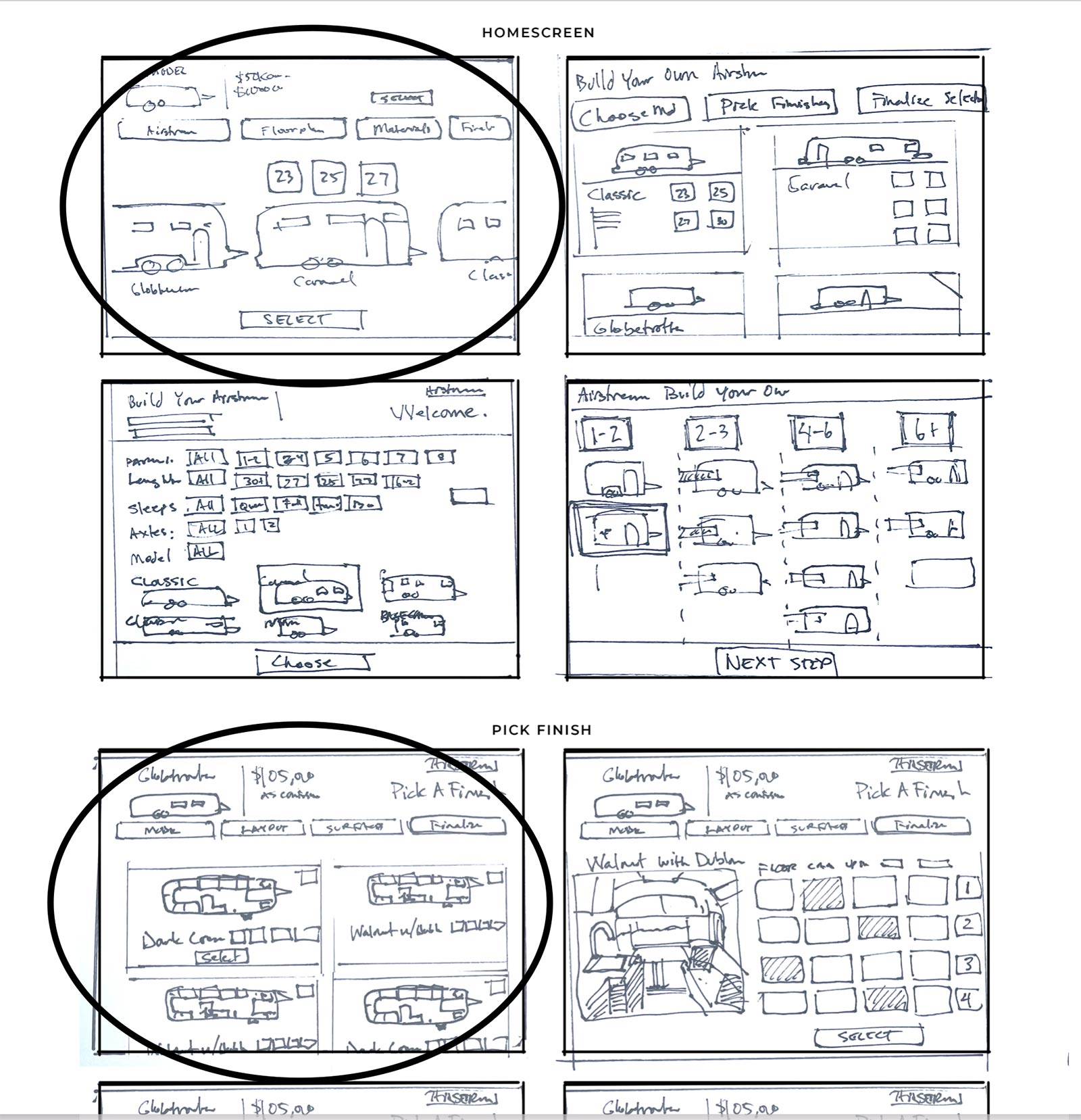
I drafted a number of versions of each screen and feature addressing do they solve the user pain points.
Designing the key features
-
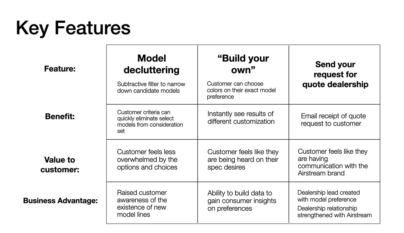
I used the input from my interviews to weigh the pros and cons of feature designs. Model decluttering quickly filter out models that are not appropriate options for the personas
-
I made sure to capture the benefits and values or feelings the customer can experience because of the feature, as well a the business advantage of each.
-
I drafted iterations of each app screen on paper to ensure the elements that made it to digital wireframes would be well-suited to address user pain points.
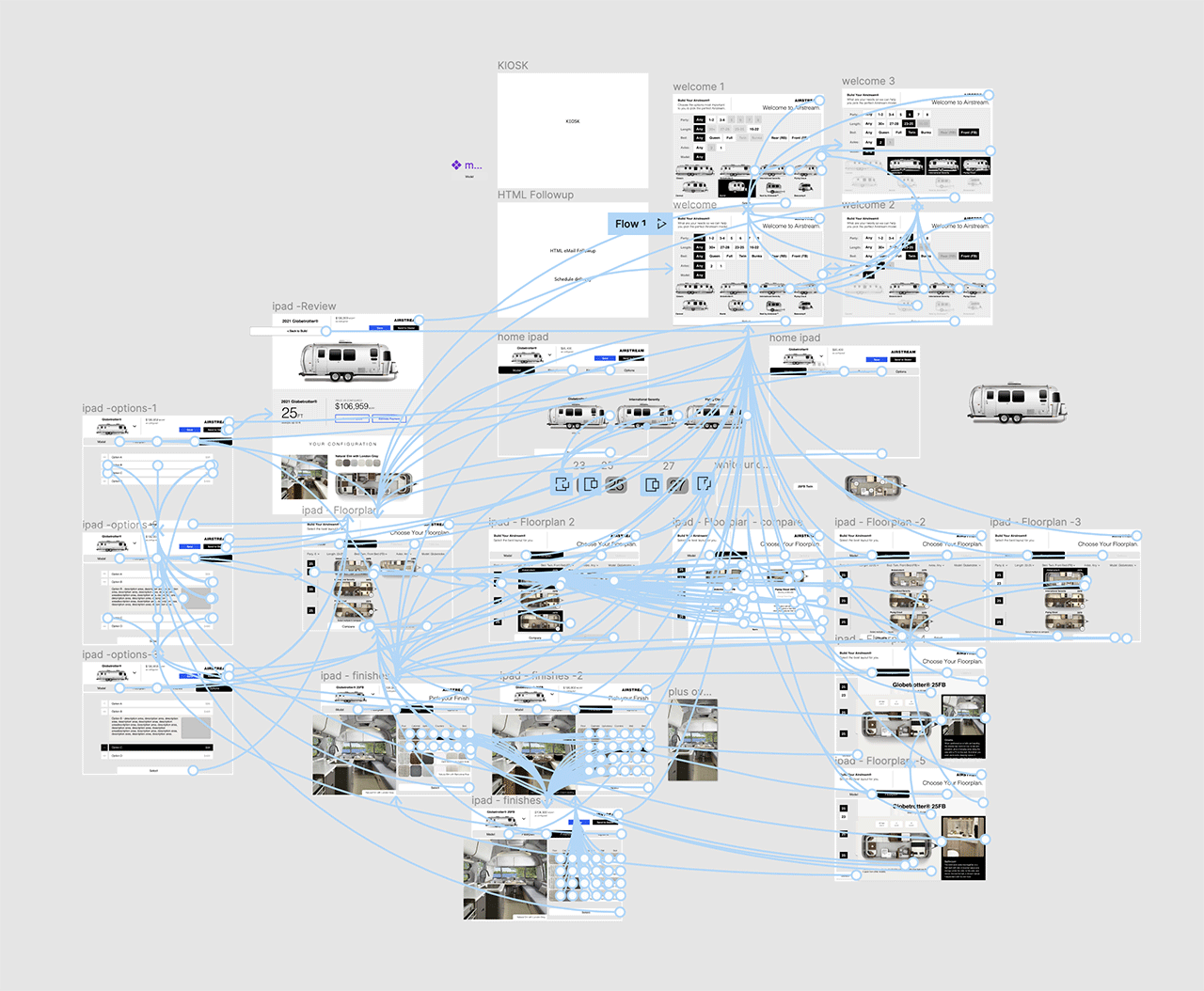
Airstream Prototype Flow
Road testing prototypes
From paper wireframes to digital prototypes
I created a Figma prototype knowing that I was going to use an iPad Pro to field test features with users.
Using the completed set of digital wireframes allowed me to create an interactive prototype to test functionality with users.
THE PROCESS
User testing revealed insights
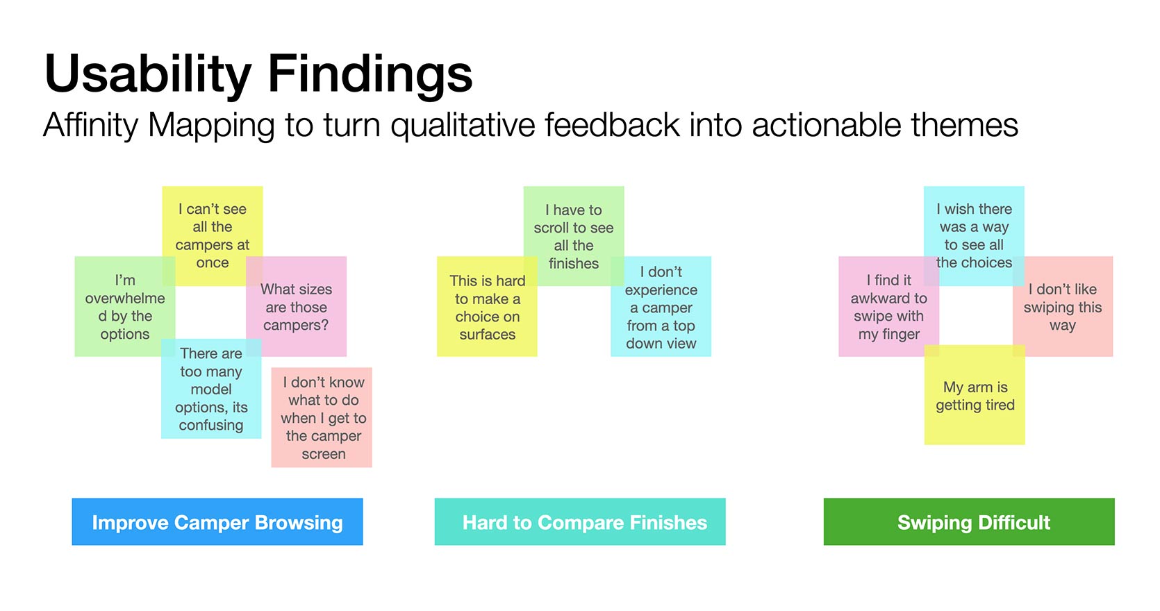
Affinity Mapping turning qualitative feedback into actionable themes
I collected my observations into a chart and gather common themes from the user’s experiences with the prototype. I was also able to observe body language that I was able to note additional emotions testers were experiencing.
One of the interesting observations was difficulty scrolling horizontally on an iPad when the iPad was resting at a 45 degree angle on a picnic bench. This configuration was done to simulate usage in a kiosk.
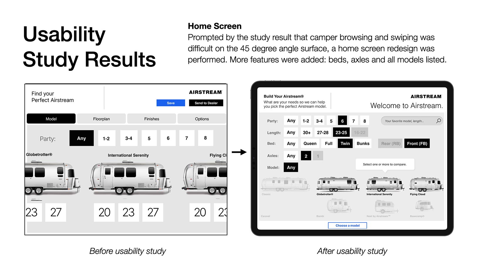
Usability Study & Results
After the study, mandatory design improvements needed to be made. The experience helped me formulate the apps most powerful feature the subtractive filter using any parameter to remove Airstreams from users consideration set.
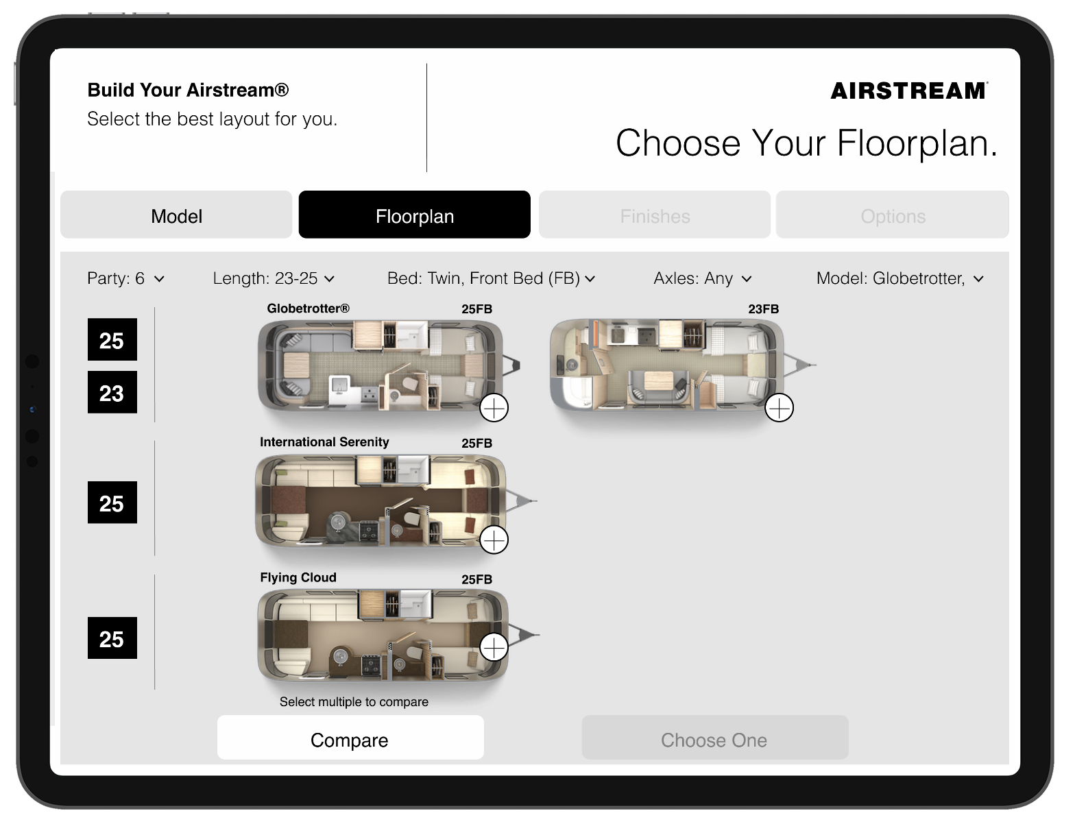
All options on one screen, no scrolling users can select their parameters in a non-linear fashion to quickly let them know things like: A twin bed, front bed configuration is not available in the Classic model, but it is available in the new Globetrotter model

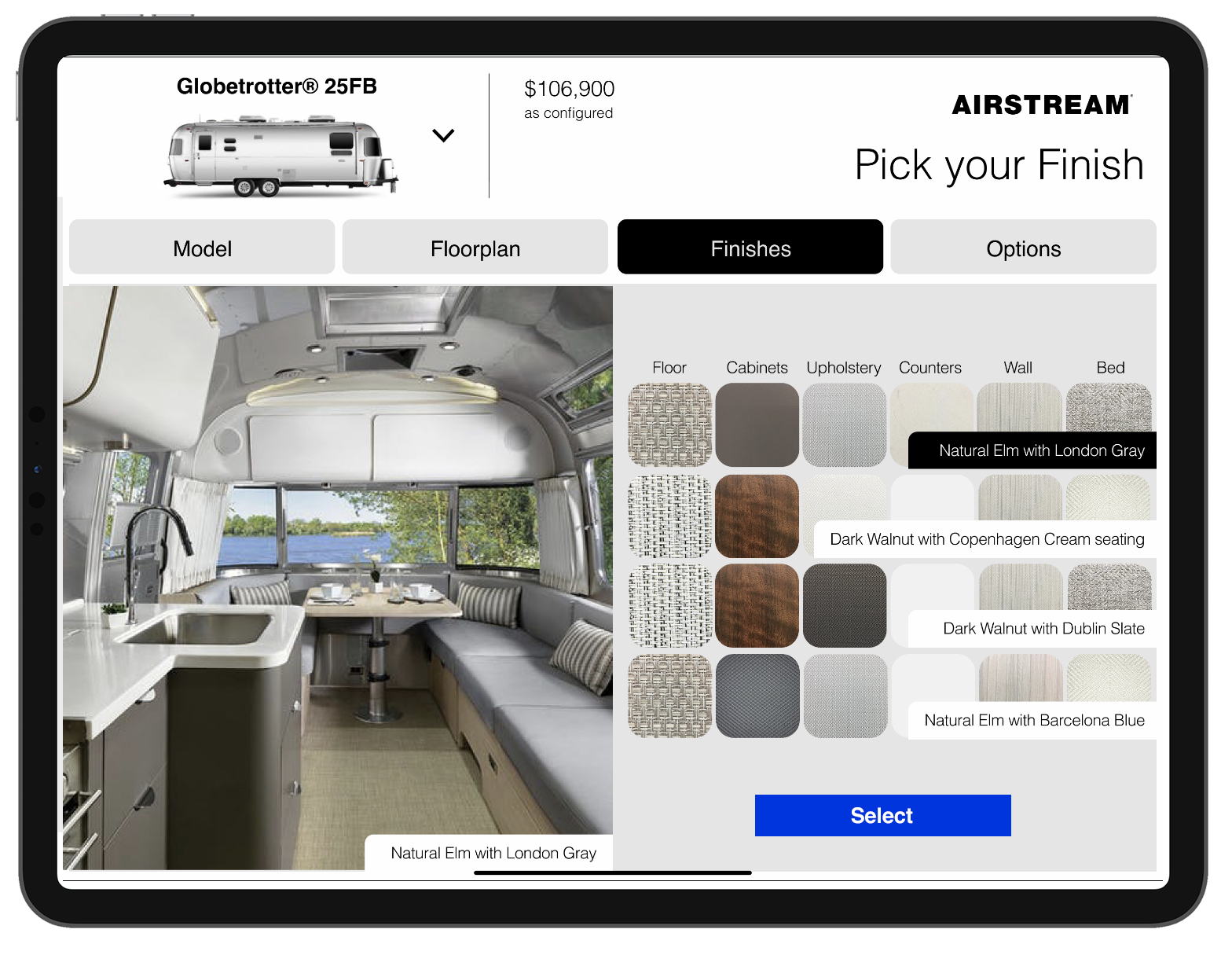
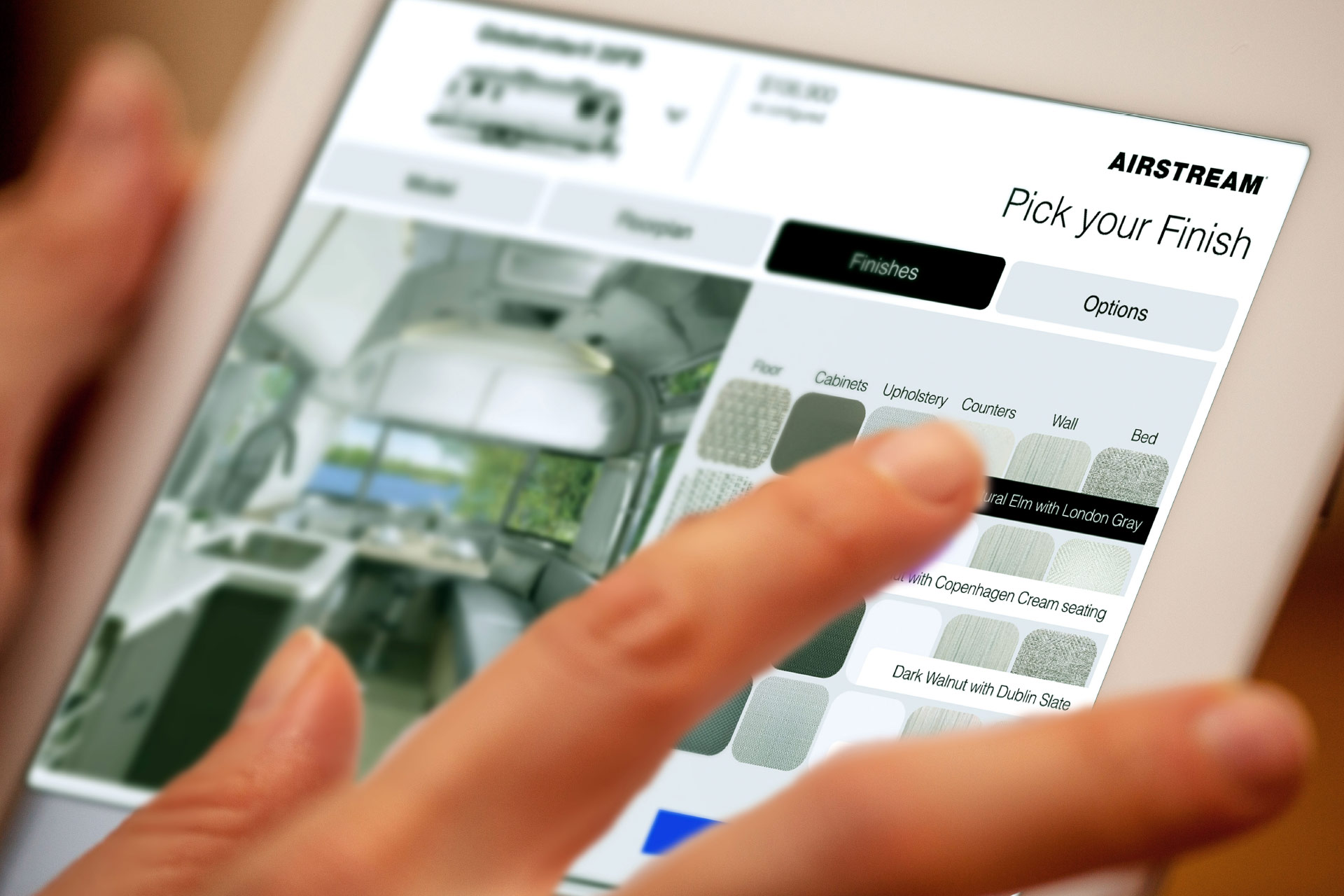
Pick your finish screen (right)
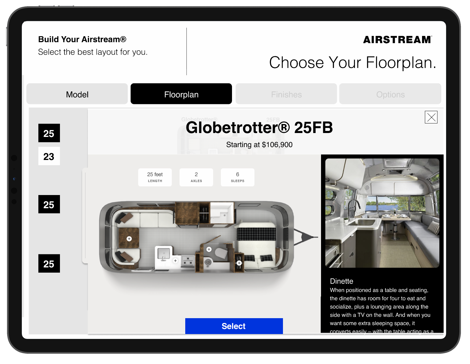
THE DESIGN: Floorplan
- The remaining models after phase one of filtering can be further explored in detail on the Floorplan screen. Models across product lines can be directly can be compared, up to three.
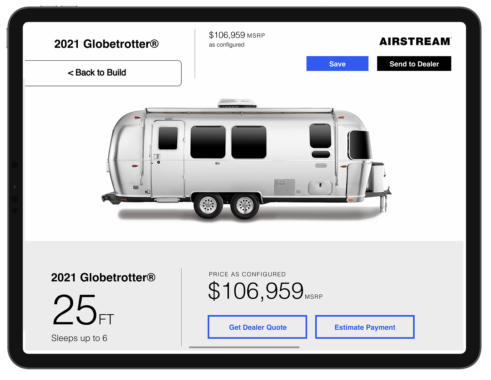
- Finishes and treatments can be selected to instantaneously preview the Airstream you are building.
- Options can be selected to complete the configuration.
- Sending to Dealer will generate an email to a Sales Lead at a regionally appropriate Airstream Dealership near the customer.
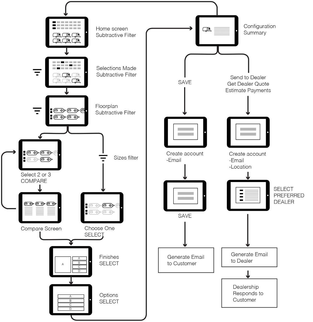
User Flow
Since the subtractive filter feature was added, it prompted me to update the user flow to reflect there were multiple paths the user could take to narrow down their airstream selection.
Notes: Users are able to compare Airstream models easier when more options are eliminated from the consideration set.
A tool that improves business relationships
This digital tool improves the relationship between the customer, brand and dealership. Airstreams are in high demand and customizing your own will take months to execute.
The
What I learned from this project as the designer
The unlimited power of research. As a designer it’s easy to fall into the trap of assuming what your users need. A good research plan an execution will always provide surprising insights that will humble your assumptions.
Learning that users did not want to swipe horizontally and needed to see all the model on the screen at once completed changed my design approach and ultimately improved the product.
From shipping software to crafting experiences, I've been around the block
Here are some stories and case studies from my design experience:
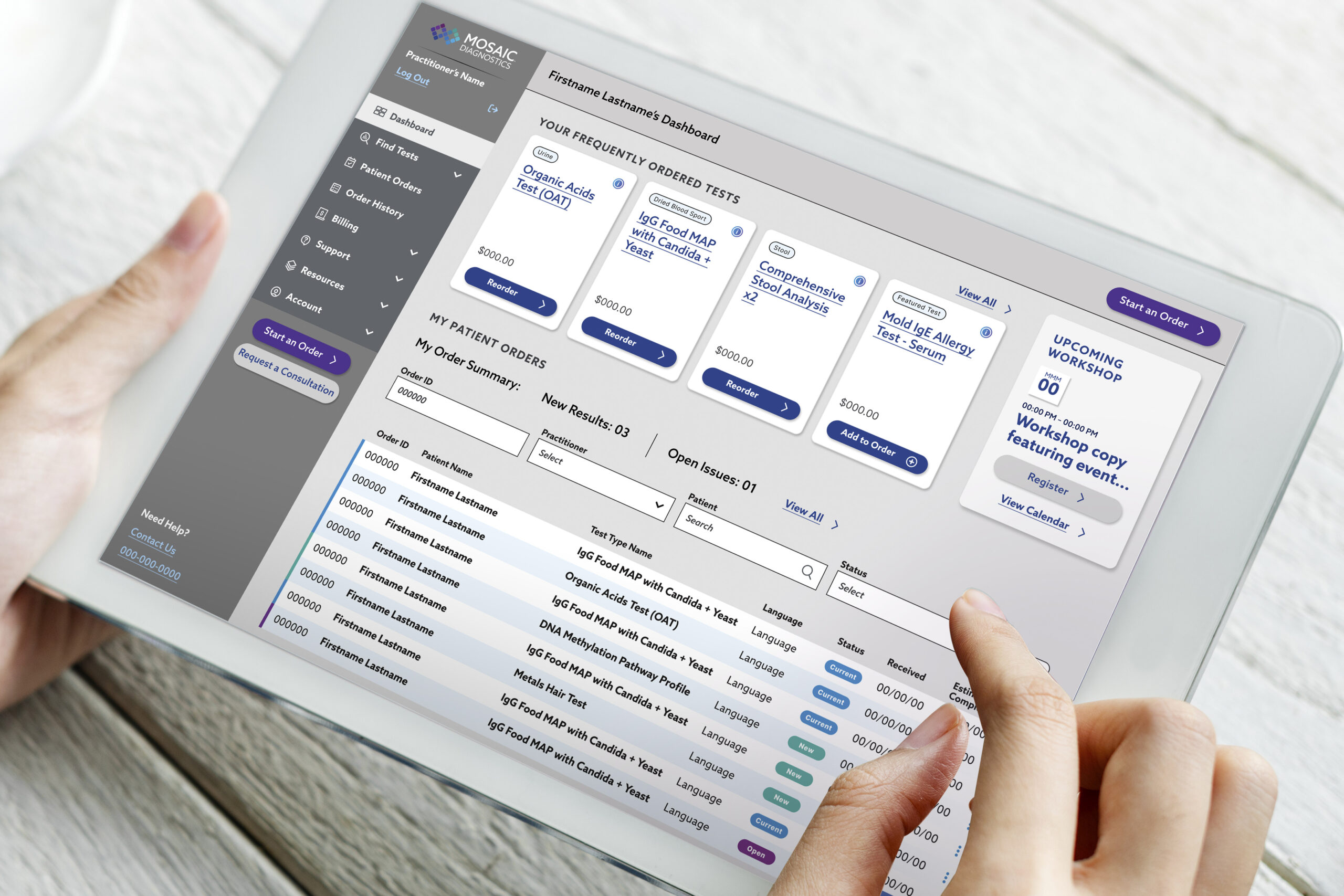
A health tech platform that optimizes test kit delivery
My product design journey improving the the portal experience for patients and practitioners—driving results for end users.
A tool to help customers select an Airstream model to fit their camp style
My journey through camper research, customer interviews, and leading the product design for a tool designed to increase consumer confidence.
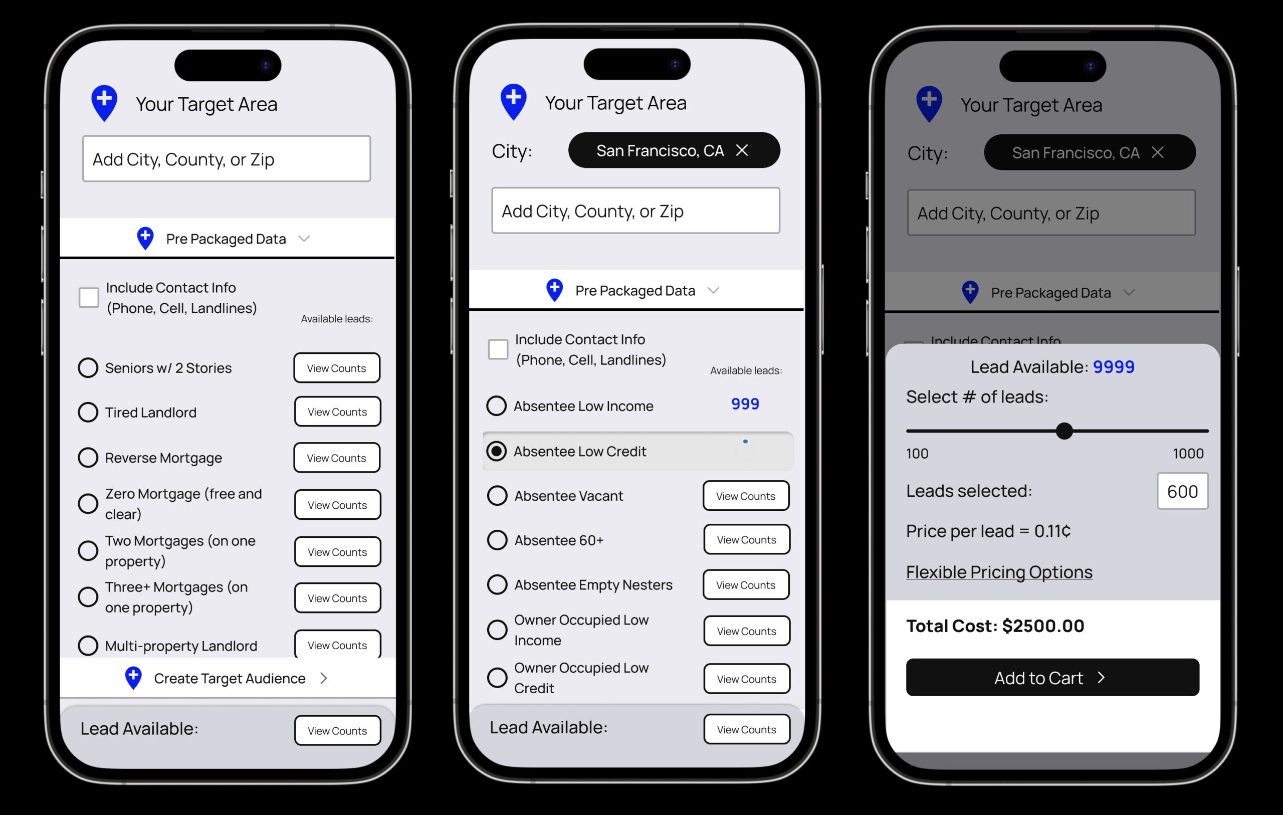
Auditing a real estate data Saas product to improve ecommerce
Improving an ecommerce user experience for a real estate data provider.
Mobile app and experience projects
A review of screen captures for a few mobile interaction design products that lead into comprehensive product design case studies.
Changing the way a global hospitality company creates interactive proposals
I brought to life a business pitch and proposal with interactive elements, sounds, videos and immersive experience that helped my client tell their story in a memorable way.
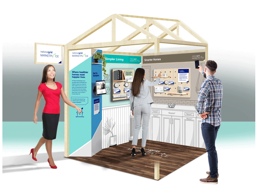
A pop up home experience that brings energy saving products to life
A case study that walks through the planning, design and execution for the traveling mobile exhibit that packs in four rooms of a household into a carefully designed, 5x5 foot space.
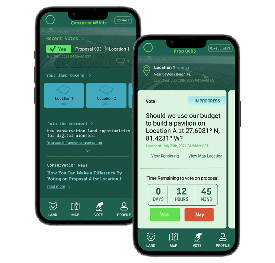
Designing a web3 platform to enable user access environmental conservation initiatives
Conserve Wildly is a mobile app platform designed to make it easy for allow citizens to vote on local conservation protection measures and proposals.
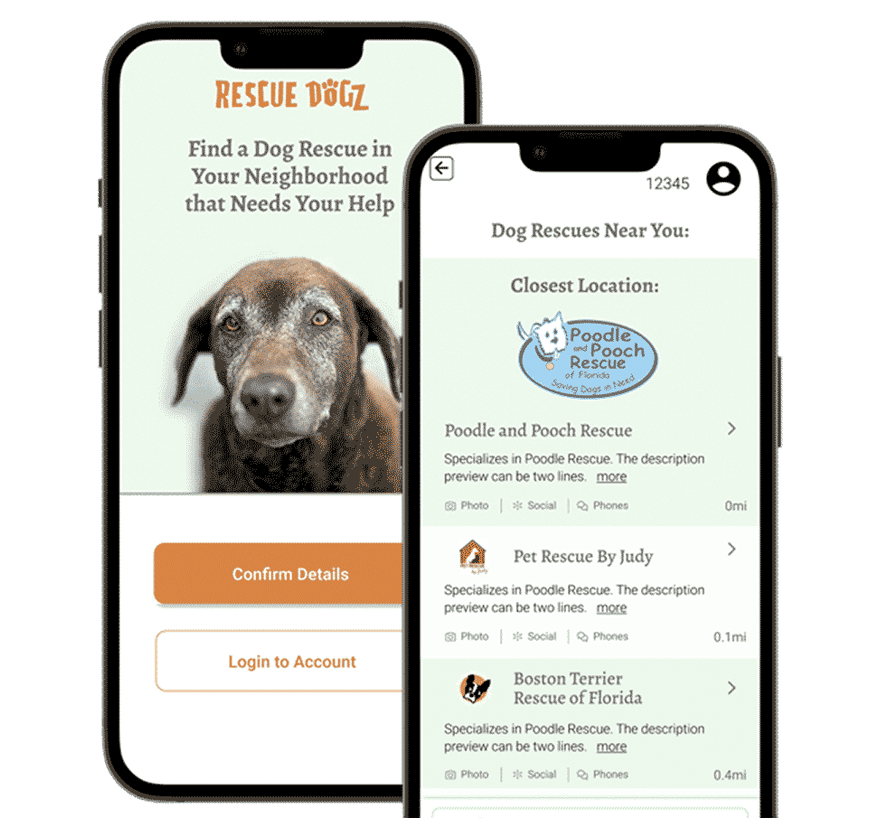
Matching volunteer's talents with dog rescues that need their help
The Rescue Dogz app is a platform connecting skilled volunteers with nearby dog rescues that need their help.
Want to learn more about me?
Feel free to reach out.


