BRINGING AN ENERGY SAVING DIGITAL MARKETPLACE TO THE REAL WORLD
I was working with an agency, Fuse Ideas, their client National Grid needed to put their energy saving products in the hands of their existing power grid customers.
THE CHALLENGE
CREATE AN EFFECTIVE POP UP SHOP IN A SMALL, PORTABLE FOOTPRINT
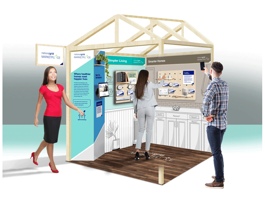
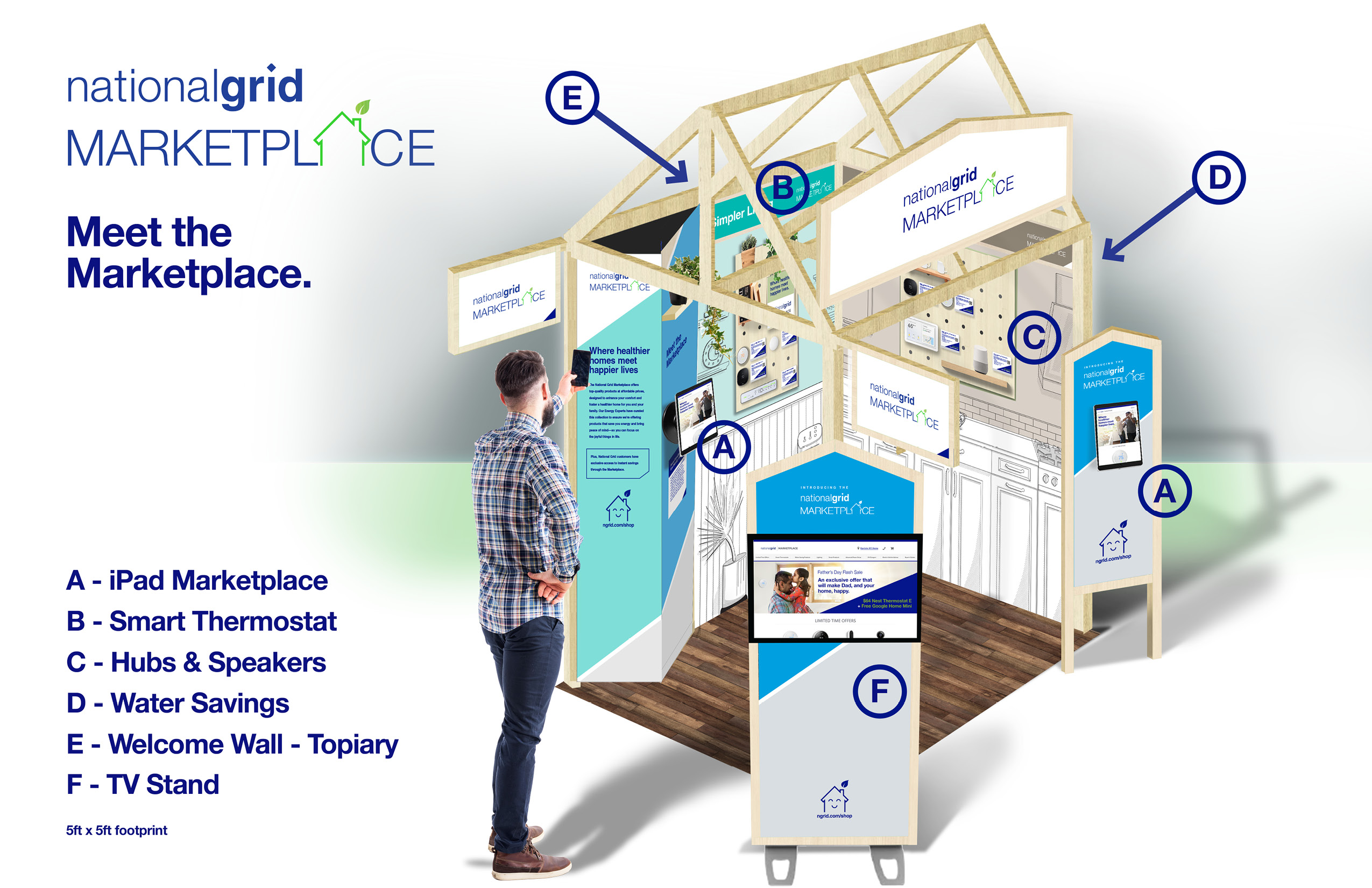
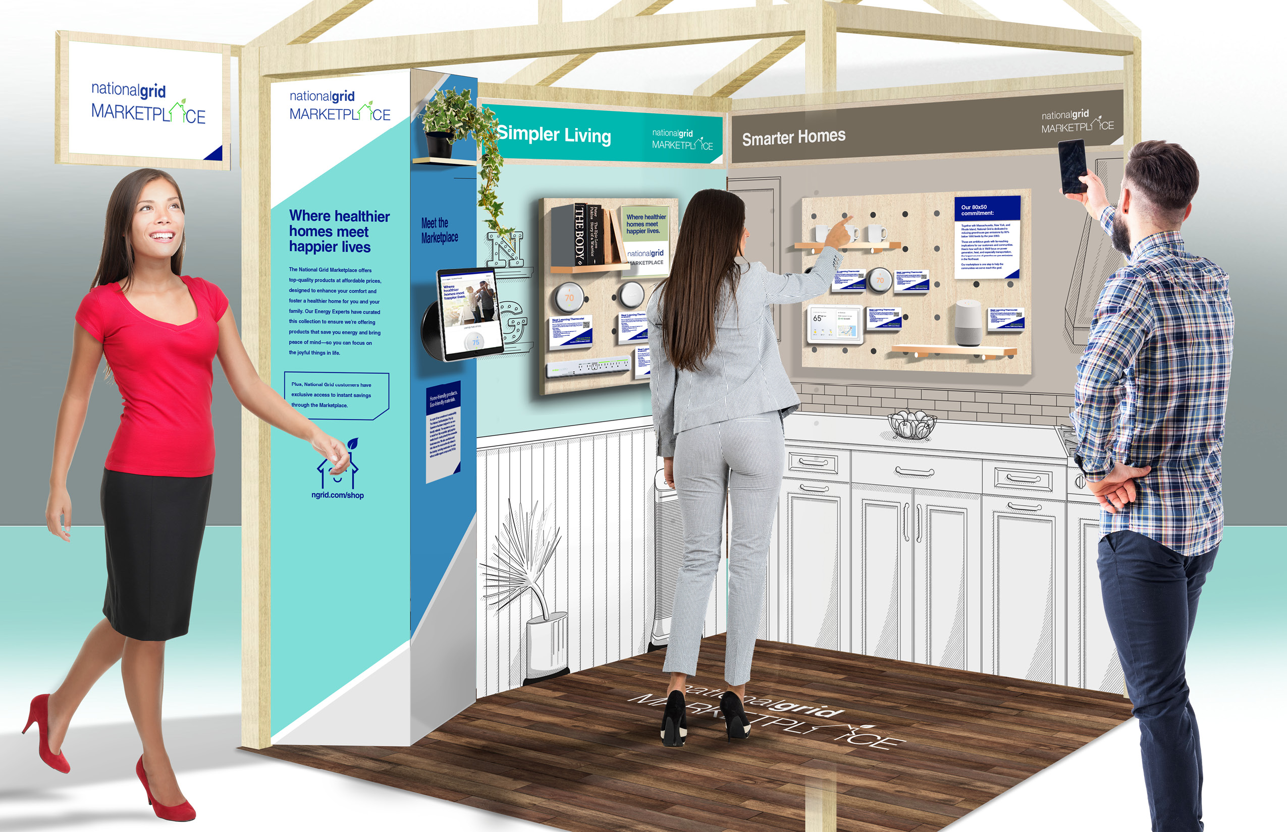
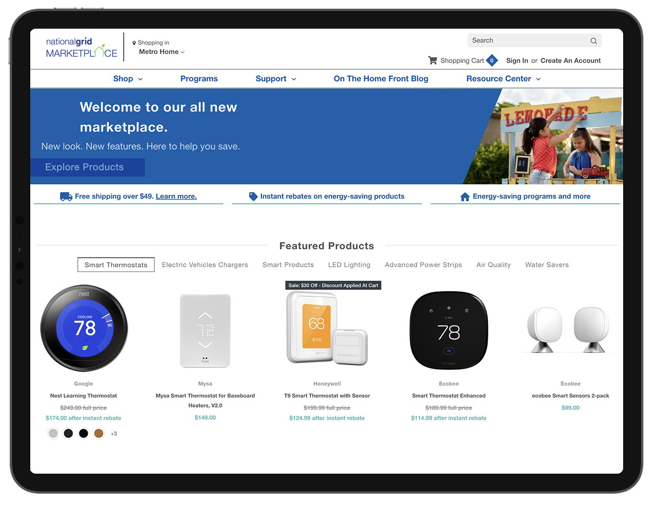
Fuse Ideas was activating National Grid’s customer base by creating a offline-to-online experience, a portable pop up shop to tour series of locations where customers could engage with power and water saving products and make a purchase onsite through an iPad.
As the principal designer on the project, my initial task was to learn about the users, design an immersive “home” experience to demonstrate energy saving products packed into a 5x5ft exhibit footprint.
THE USERS
The personas were profiled as busy families with young children who owned their home for the past few years and were in that period of time where they were open to the prospect of using new technology to “optimize” their energy consumption in their home. They were willing to install products in their home to make it more efficient. They didn’t know where to start and they certainly didn’t know about the National Grid Marketplace… yet anyway.
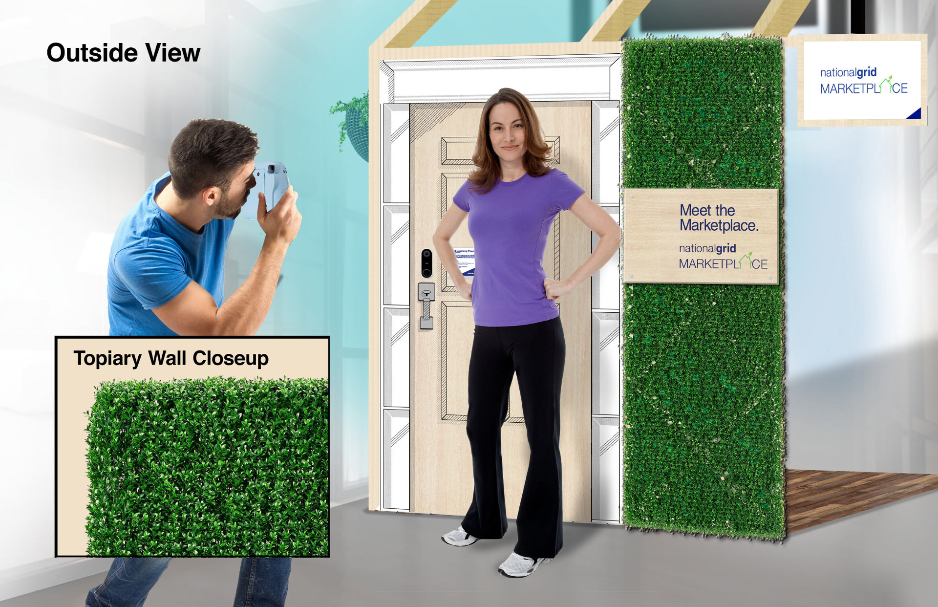
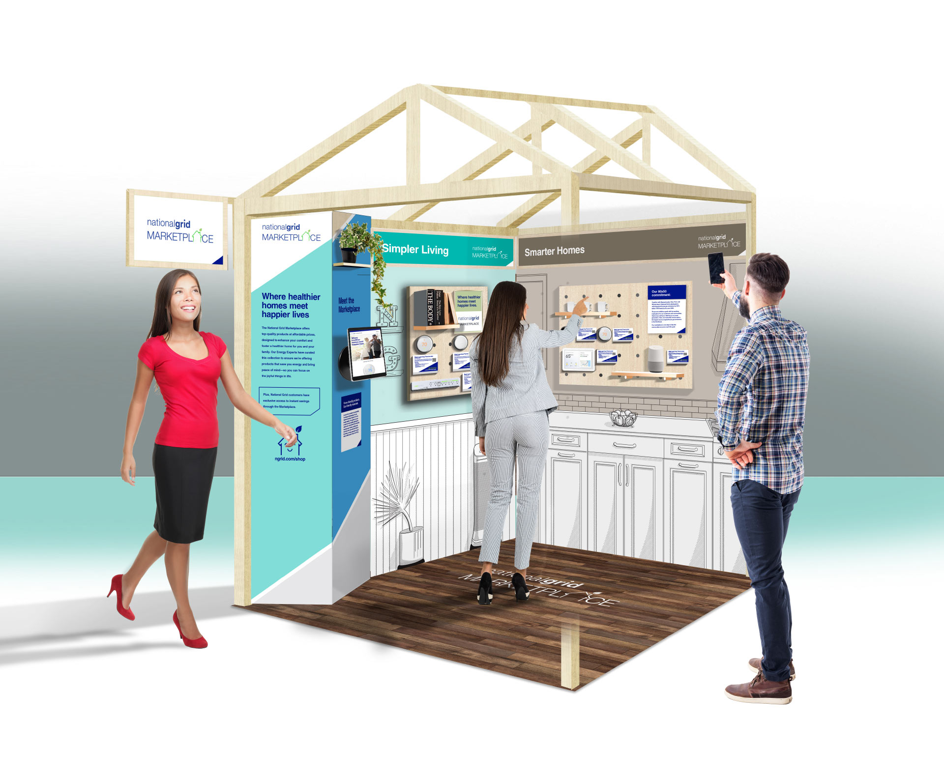
THE IDEA
Integrate the products and technology into a modular physical space that “feels like the customers home” where they can explore all the rooms of their home in a small space, featuring the products in context of the appropriate rooms: living room, kitchen, bathroom, exterior.
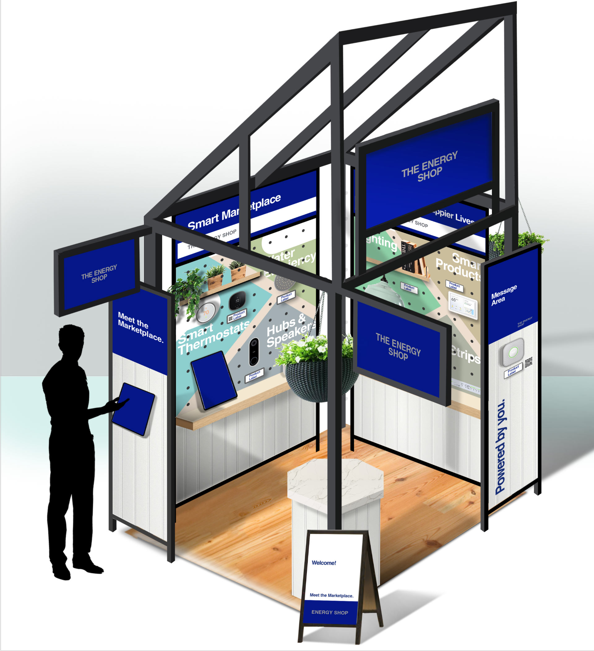
MY ROLE
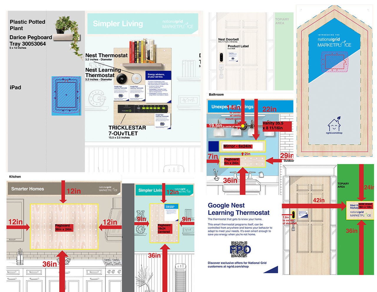
I led the creative direction, design and illustration of the marketplace pop up. I explored many form factors leveraging a peg board modular systems to feature products. Explored design systems, design styles, texture, layout, expressed through presentations of sketches, 3D renderings and branding.
INTEGRATING WITH A DIGITAL EXPERIENCE
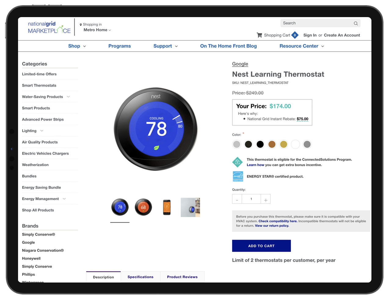
Each “Room” featured products with display cards and QR codes that allowed customers to visit National Grid Product landing pages featuring each product for purchase.
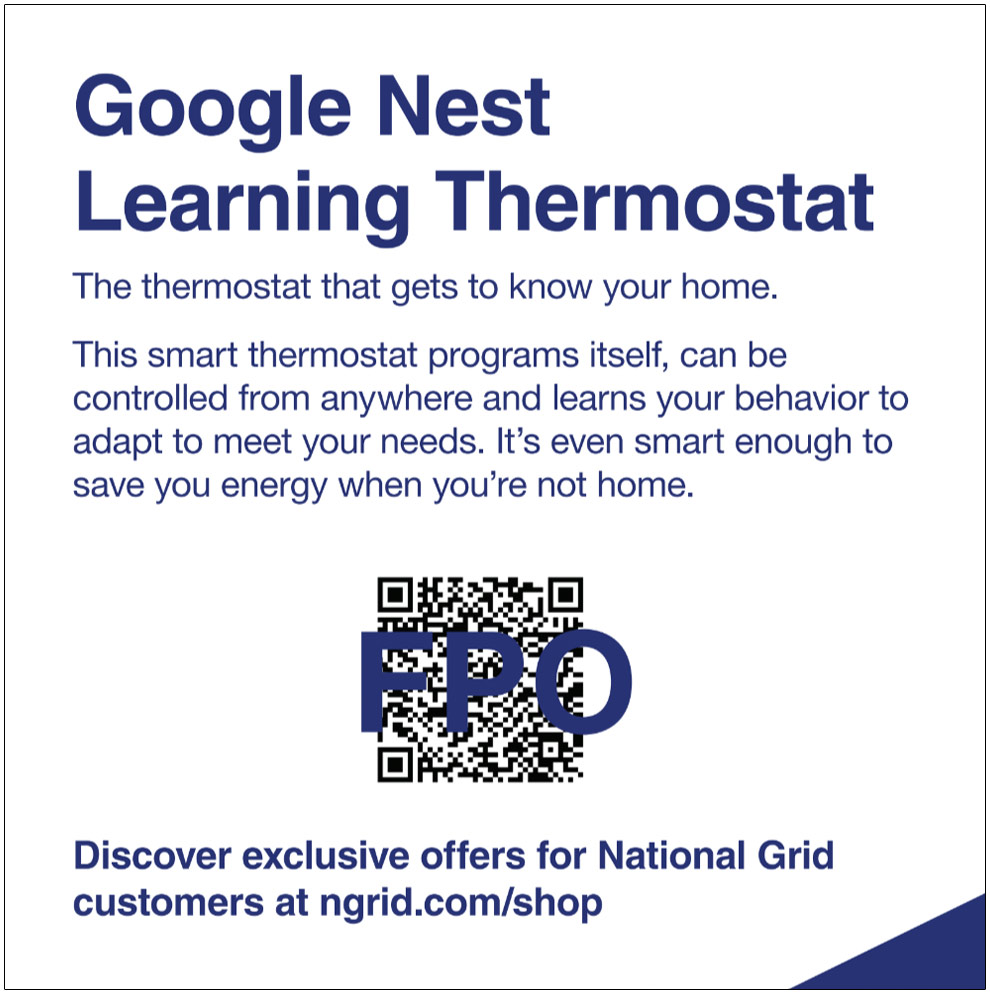
THE PROCESS
I choose an ikea style birch wood pegboard that was central to the modular approach to feature product cards, QR codes, physical products on display offering flexibility to feature different products for different markets and locations.
THE RESULTS
Through National Grid’s relationships with their energy saving products companies they were able to pass on reduced costs to families. Additionally they were able to extent their positioning as steward to helping families save money by lowering their electric bills and save on discounted energy-saving products.
From shipping software to crafting experiences, I've been around the block
Here are some stories and case studies from my design experience:
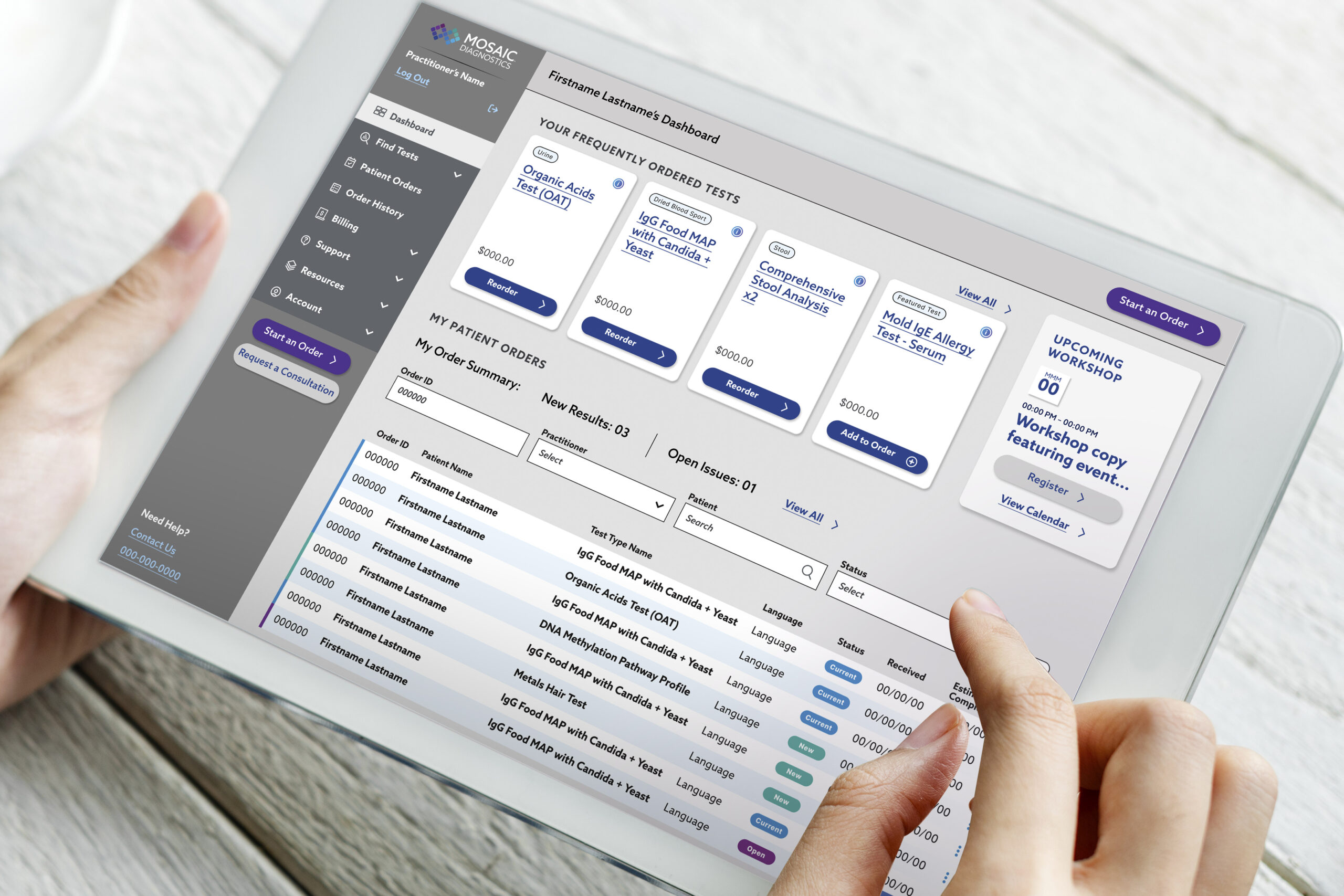
A health tech platform that optimizes test kit delivery
My product design journey improving the the portal experience for patients and practitioners—driving results for end users.
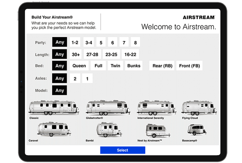
A tool to help customers select an Airstream model to fit their camp style
My journey through camper research, customer interviews, and leading the product design for a tool designed to increase consumer confidence.
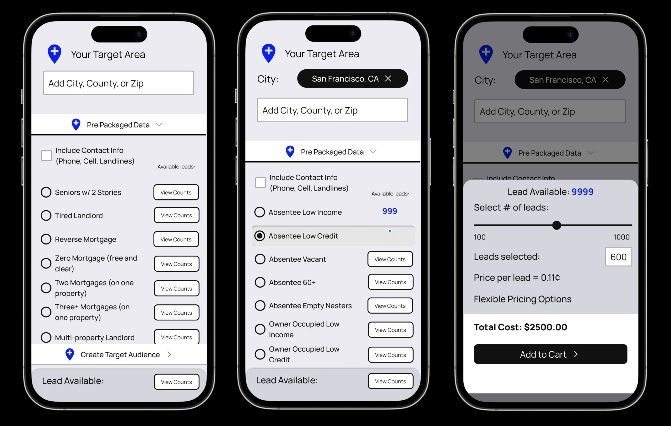
Auditing a real estate data Saas product to improve ecommerce
Improving an ecommerce user experience for a real estate data provider.
Mobile app and experience projects
A review of screen captures for a few mobile interaction design products that lead into comprehensive product design case studies.
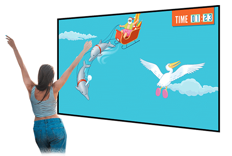
Changing the way a global hospitality company creates interactive proposals
I brought to life a business pitch and proposal with interactive elements, sounds, videos and immersive experience that helped my client tell their story in a memorable way.
A pop up home experience that brings energy saving products to life
A case study that walks through the planning, design and execution for the traveling mobile exhibit that packs in four rooms of a household into a carefully designed, 5x5 foot space.
Designing a web3 platform to enable user access environmental conservation initiatives
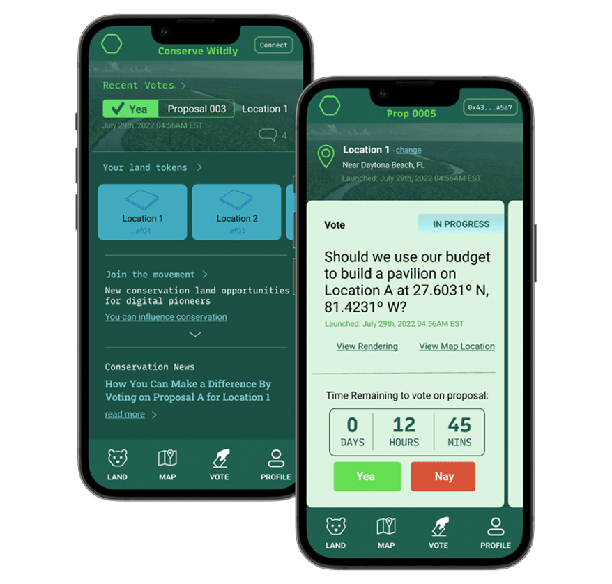
Conserve Wildly is a mobile app platform designed to make it easy for allow citizens to vote on local conservation protection measures and proposals.
Matching volunteer's talents with dog rescues that need their help
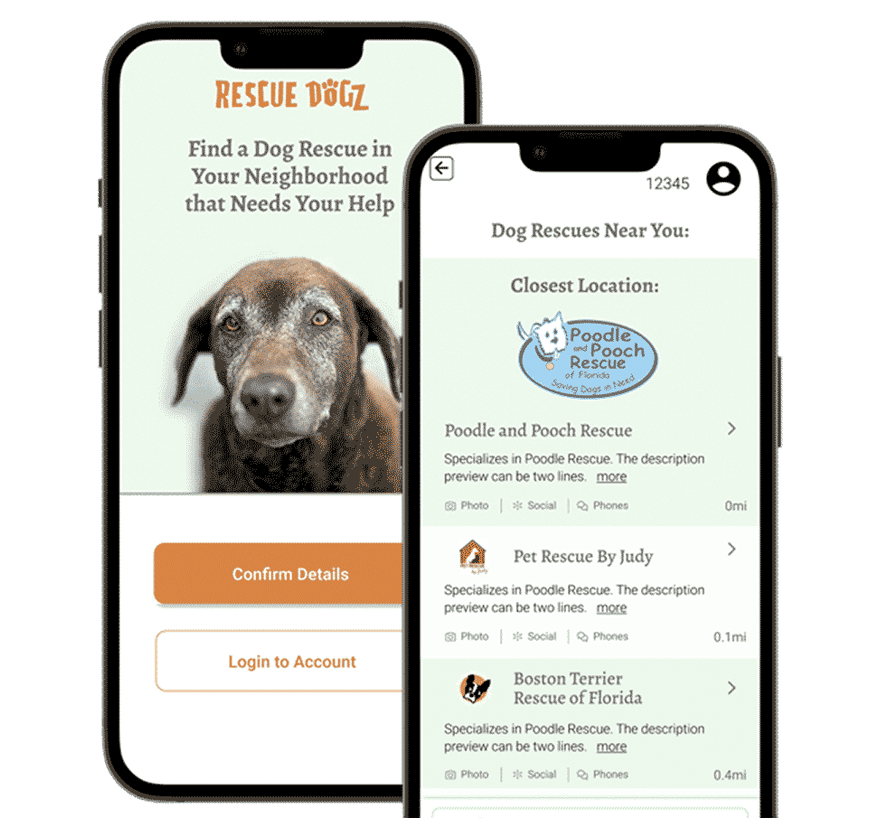
The Rescue Dogz app is a platform connecting skilled volunteers with nearby dog rescues that need their help.
Want to learn more about me?
Feel free to reach out.


