“FLYING” YOUR WAY TO SCORE
A DREAM VACATION TO FLORIDA
During the winter, residents of the northern American states long to escape the cold and snowy winters and travel south to Florida for fun in the sun, and a beach experience,
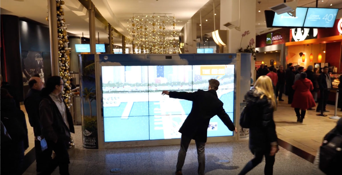
THE IDEA
Create an interactive marketing platform that uses body gestures of participants to navigate Sandy the Pelican’s south bound flight for the winter.
THE LOCATION
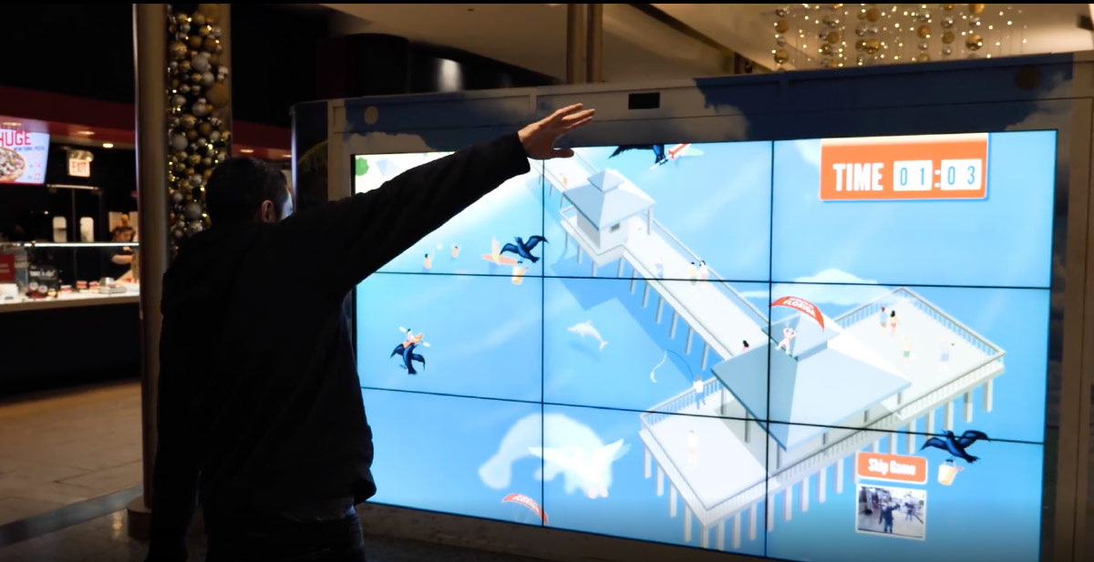
A video screen was installed at high foot traffic areas in the Chicago mall and O’Hare Airport to entice people to “Win a Trip to Fort Myers Beach, Florida”.
THE CHALLENGE
CREATE THE INTERFACE PLATFORM CREATIVE CONCEPT, AND ILLUSTRATIONS IN 40 DAYS
MY ROLE
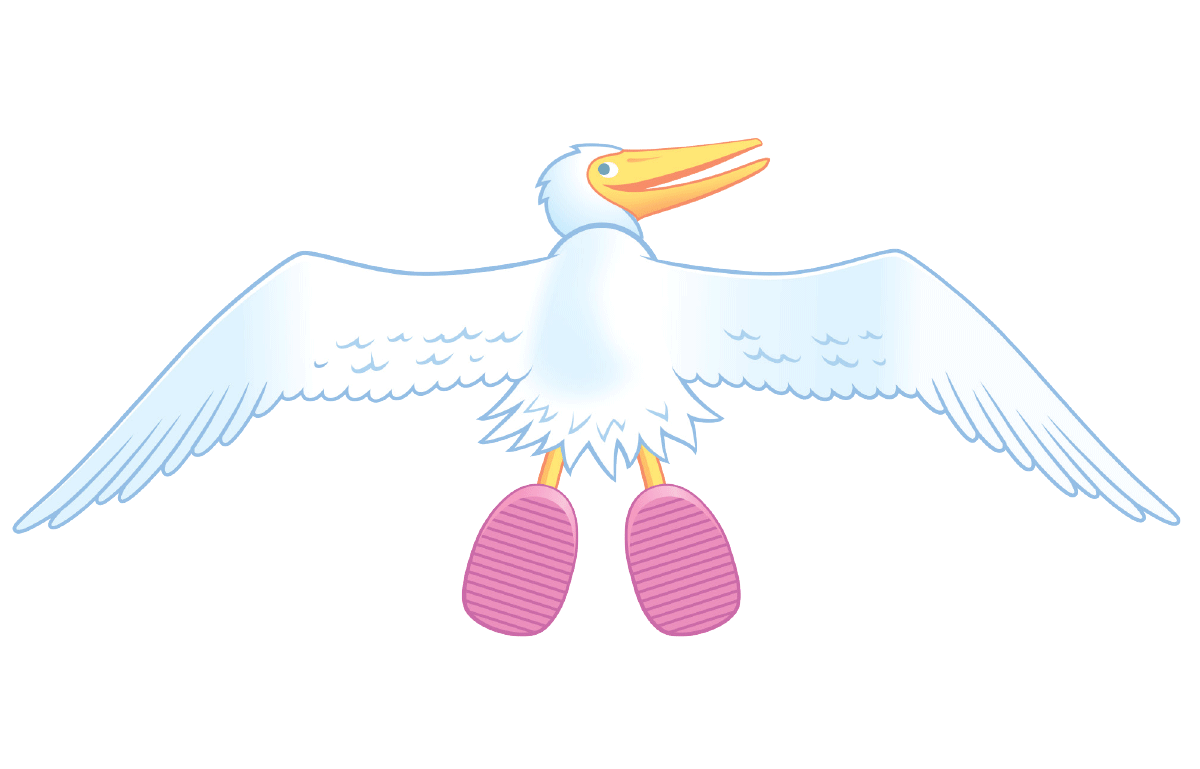
As the principle designer and art director on the project, my goal was to create an experience that was engaging and immersive for players. This takes into account gameplay, style of animation and illustration, as well as interactivity. Once an illustration partner was selected we were able to focus on character design. After preliminary sketching and storyboarding I dove into game flow environments, obstacles, art direction, and collaborated with the illustrator to build the 2D characters and animation states.
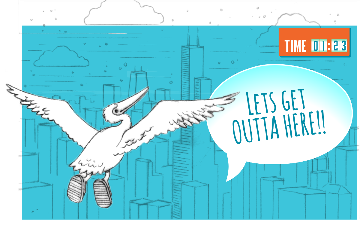
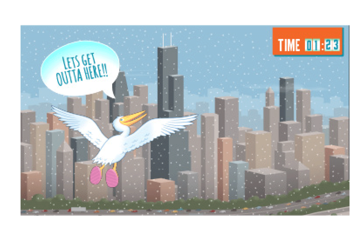
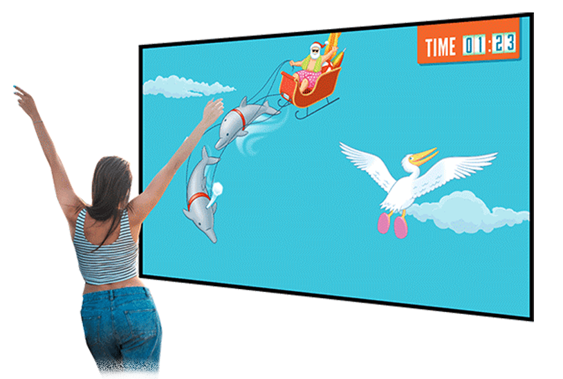
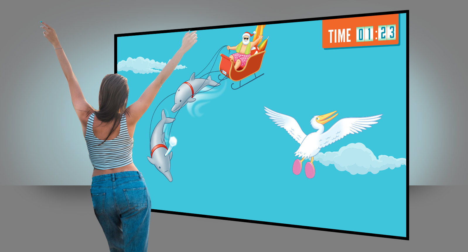
Gameplay screen produced (Right)
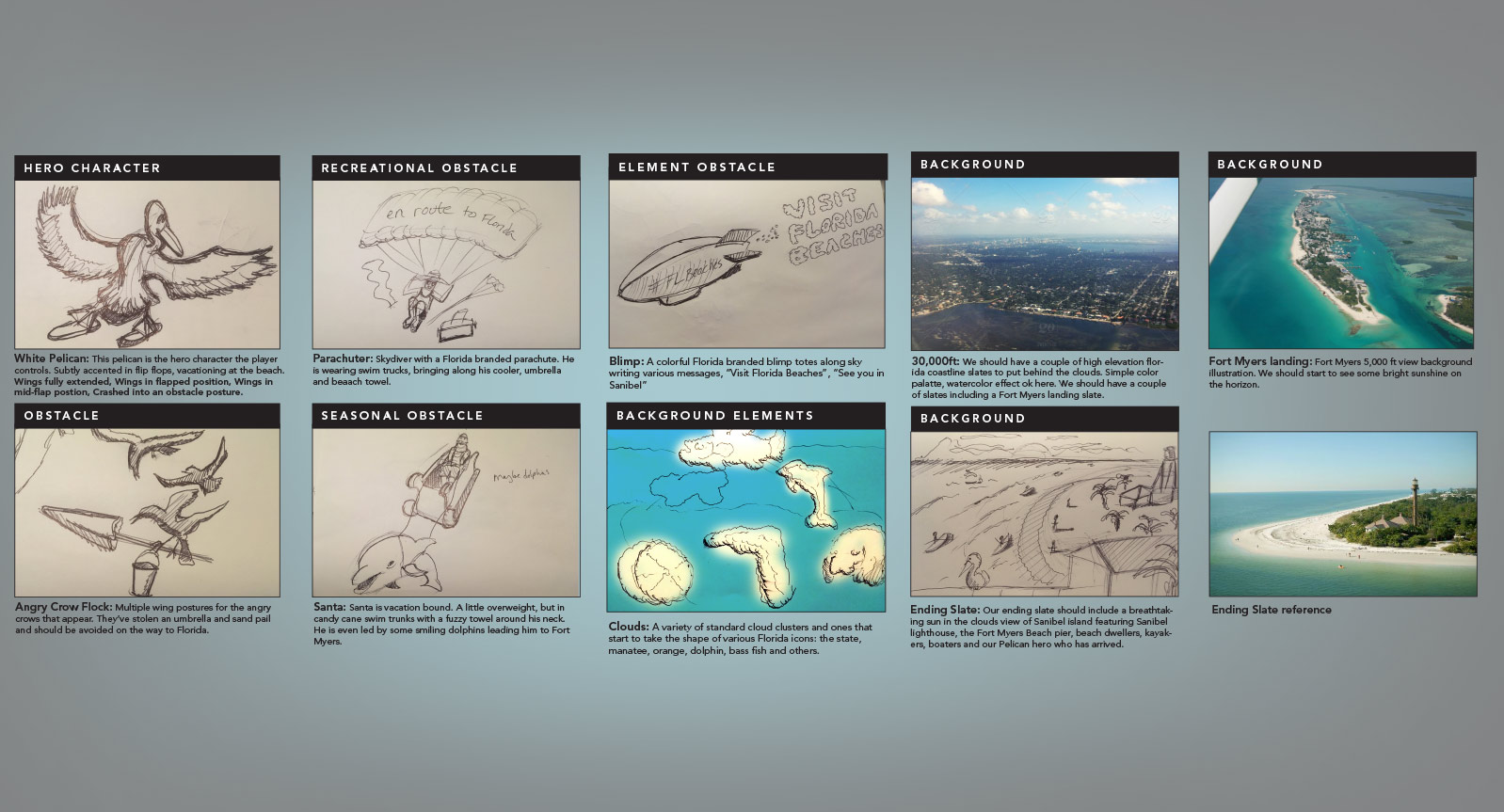
THE CHARACTERS AND STORYBOARD
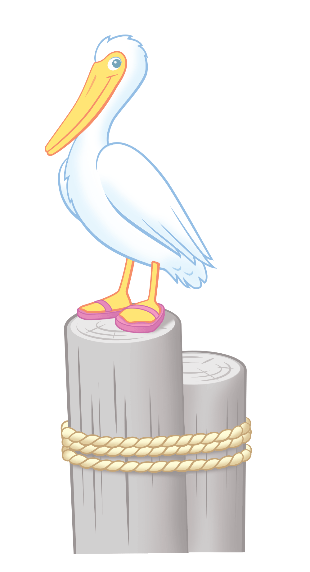
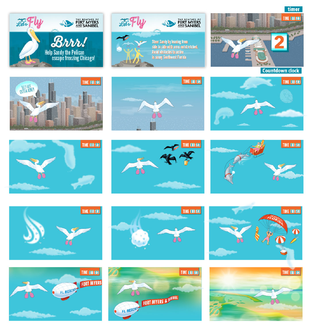
It was important in the gameplay experience for users to be reminded of their quest to reach Florida in real life. In the journey from Chicago to Fort Myers, the gameplay included hints throughout, a blimp with a Florida hashtag, clouds that took the shape of dreamy Florida icons and animals, crows carrying sand pails and umbrellas. You could also find Santa propelling his sleigh with Florida dolphins if that wasn’t evidence enough that everyone wants to go to Florida for vacation.
THE INTERFACE
PARTICIPANTS COMPETED TO HAVE THE TOP SCORE AND WIN THE TRIP
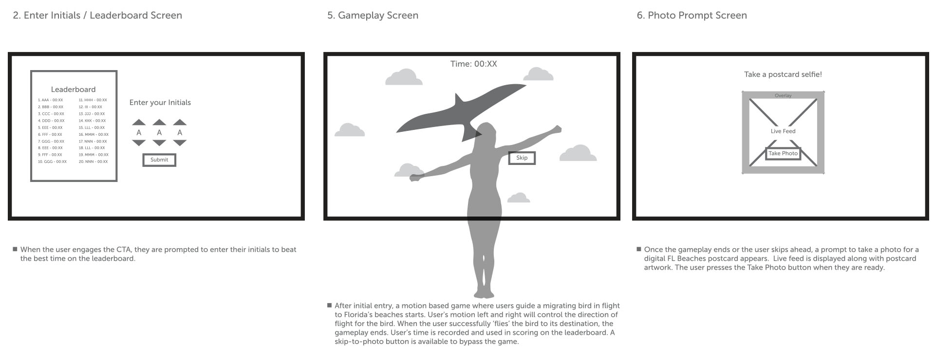
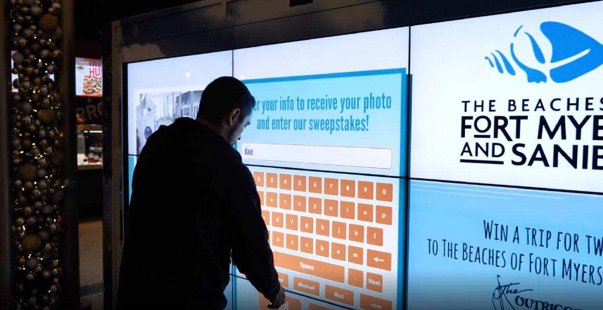
Along side illustration was wireframe development for the interface. It was all about immediacy. On an idle screen you were greeted with an invitation to read the premise of the gameplay. You were invited to enter your information for a chance to win the Florida trip.
THE INTERACTIVITY
You use your body to control the flight of Sandy. While the screen tracks downward, obstacles come into your path. Move your body and arms left and right to help the pelican avoid deterrents in the air. Once gameplay is complete, you entered your email address and took a postcard selfie. This would be followed by email reminders about your experience and reminders about sunny Fort Myers Beach in the middle of a cold Chicago winter.
VISUAL DESIGN
I collaborated with the illustrator closely to ensure that Sandy, the lead character, was friendly and approachable. I wanted to make sure the Chicago winter was portrayed as cold and inhospitable to give the participant a reminder that it would be great to leave the cold. I made sure Florida was portrayed as warm and inviting. Particular attention was paid to the environments for Fort Myers Beach and Sanibel Island, to highlight the activities of swimming, fishing and overall relaxing.
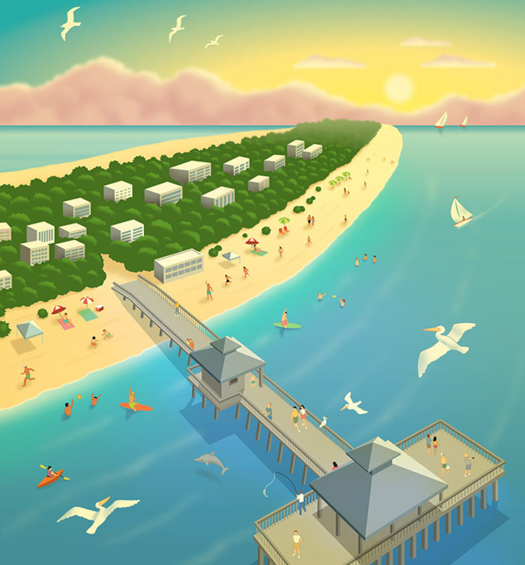
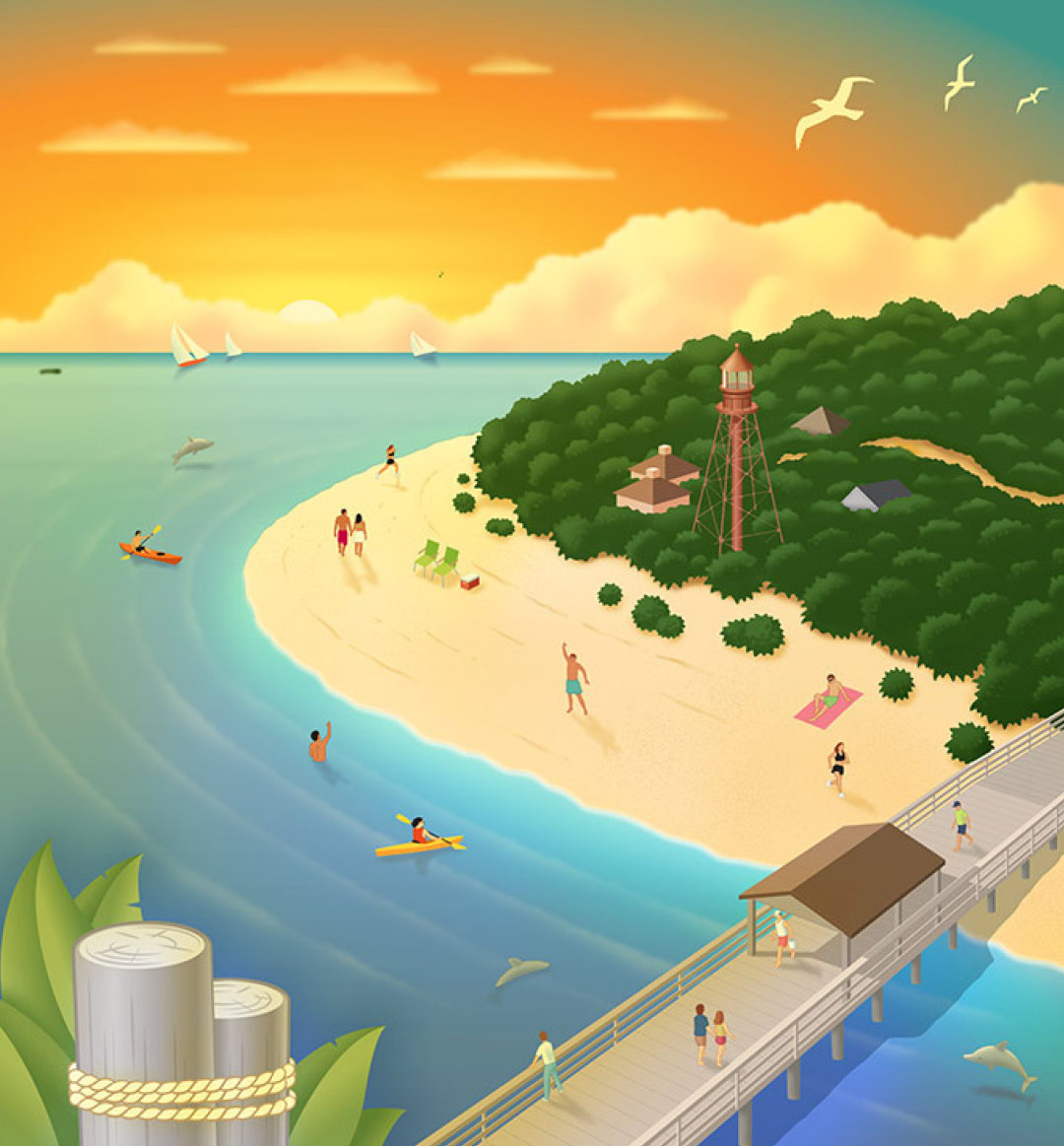
THE RESULTS
A SUCCESSFUL FLIGHT
The kiosk was placed in a high-traffic area called “The Shops” in Downtown Chicago for 5-weeks, plus two-weeks at O’Hare International Airport. Over 10,000 people played the game and took flight with Sandy The Pelican. Using geofencing techniques within a five-mile radius, Chicagoans were targeted nearby with marketing messages that guided them to play the game and enter the sweepstakes.
The campaign received average weekly initial activations of over 1,600 which surpassed comparable campaigns by at least 100 percent.

From shipping software to crafting experiences, I've been around the block
Here are some stories and case studies from my design experience:
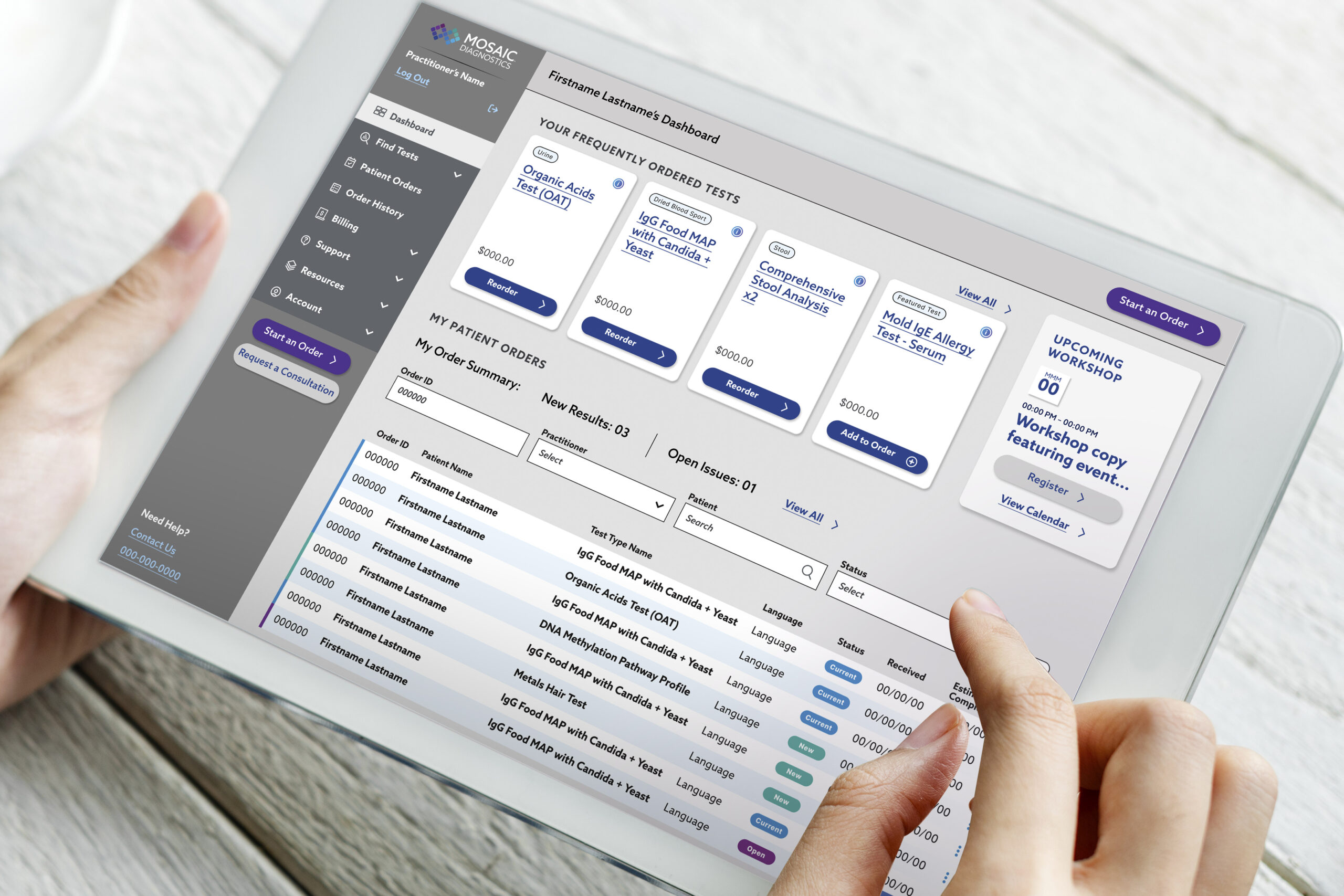
A health tech platform that optimizes test kit delivery
My product design journey improving the the portal experience for patients and practitioners—driving results for end users.
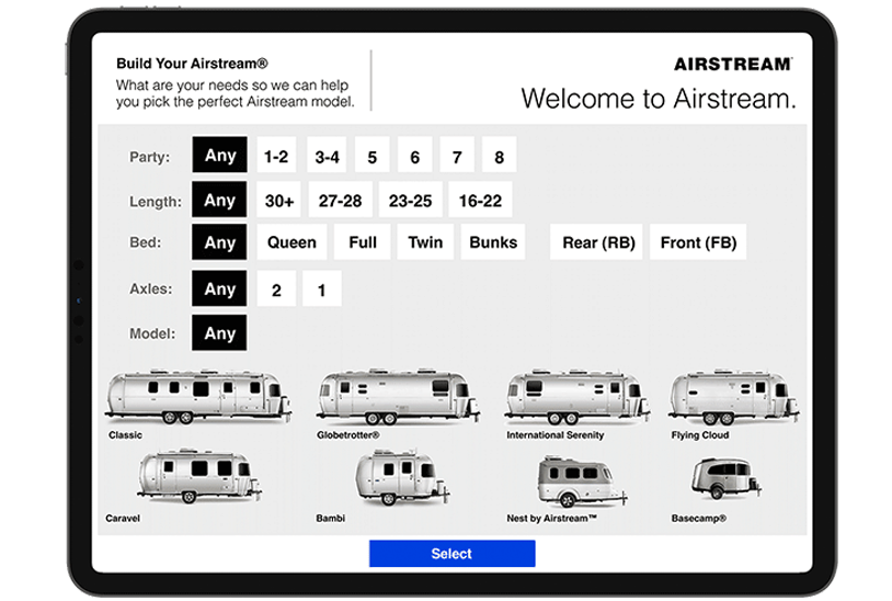
A tool to help customers select an Airstream model to fit their camp style
My journey through camper research, customer interviews, and leading the product design for a tool designed to increase consumer confidence.
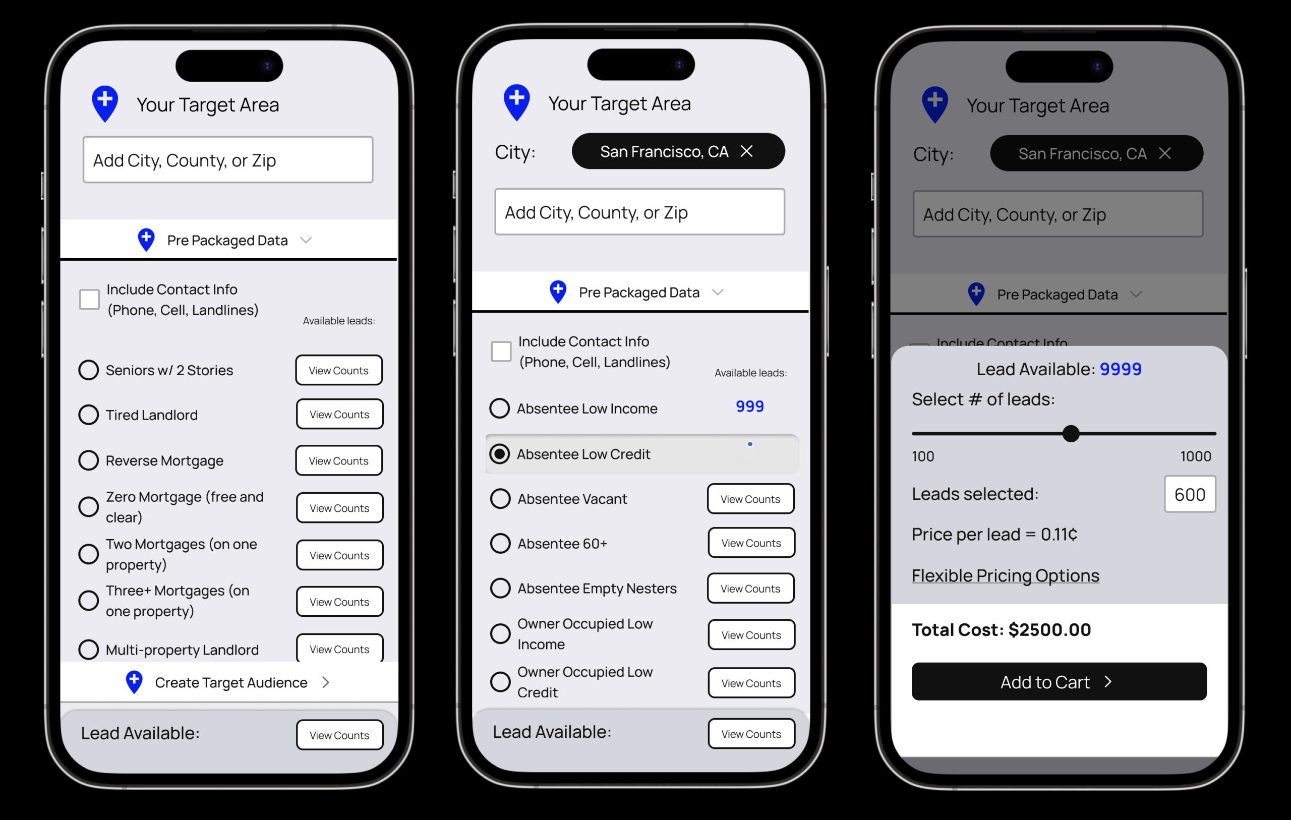
Auditing a real estate data Saas product to improve ecommerce
Improving an ecommerce user experience for a real estate data provider.
Mobile app and experience projects
A review of screen captures for a few mobile interaction design products that lead into comprehensive product design case studies.
Changing the way a global hospitality company creates interactive proposals
I brought to life a business pitch and proposal with interactive elements, sounds, videos and immersive experience that helped my client tell their story in a memorable way.
A pop up home experience that brings energy saving products to life
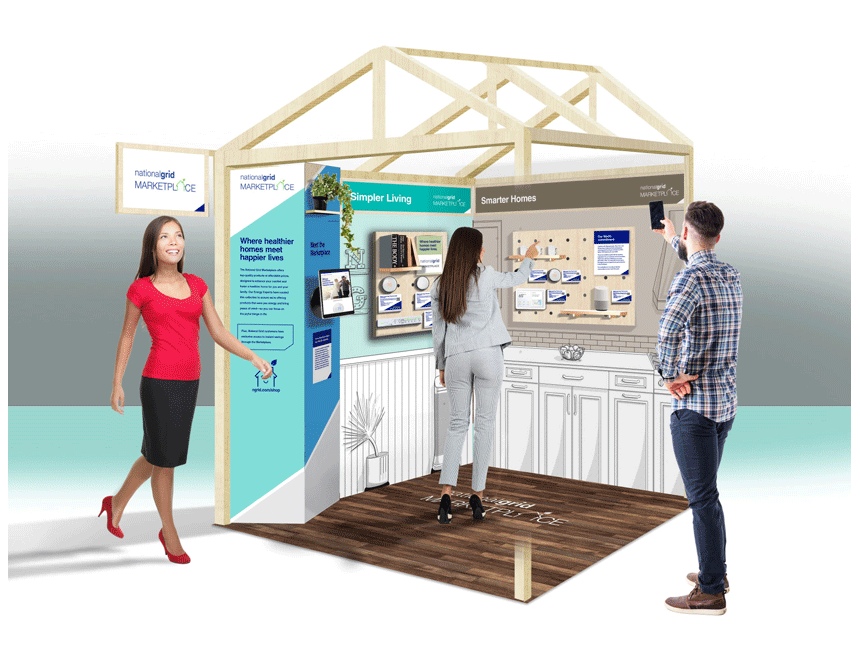
A case study that walks through the planning, design and execution for the traveling mobile exhibit that packs in four rooms of a household into a carefully designed, 5x5 foot space.
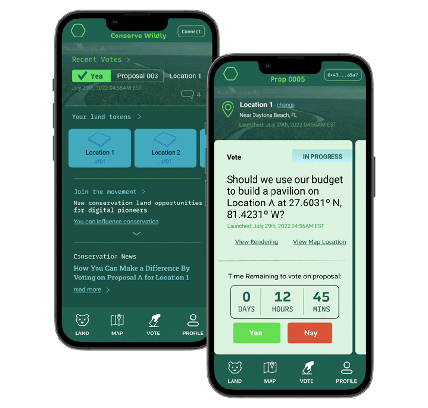
Designing a web3 platform to enable user access environmental conservation initiatives
Conserve Wildly is a mobile app platform designed to make it easy for allow citizens to vote on local conservation protection measures and proposals.
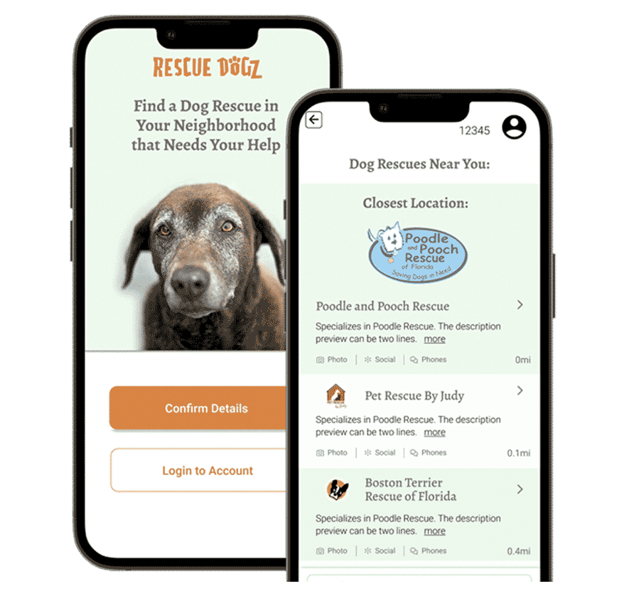
Matching volunteer's talents with dog rescues that need their help
The Rescue Dogz app is a platform connecting skilled volunteers with nearby dog rescues that need their help.
Want to learn more about me?
Feel free to reach out.


